
You know when you’ve had something on your to-do list for ages, and when you finally get round to doing it, it was so much easier than you’d thought? And you wonder why you didn’t get round to it earlier? That was me and home shopping. I buy almost everything else online, but for some reason there was some reticence about getting my groceries delivered to my door.
Perhaps it was wanting to select my own veg, or squeeze the fruit myself… and perhaps it was just that human aversion to change.
Whatever it was, I overcame it about three months’ ago, took the plunge and haven’t looked back. I’ve tried a selection of online supermarkets (usually whichever has most recently sent me a free-delivery offer), so thought I’d do a usability review of one.
There’s no clear winner when it comes to the overall usability which, of course, doesn’t just include the website experience, but delivery, returns and customer service. But just considering the online experience, Tesco’s is, at the moment, one of the best – although by no means perfect.
So what does Tesco.com do well?
Sensible, guessable categories
The categories in their second-level nav make it easy to guess where a particular product will be – I’ll usually pick the correct category first time. It could be because they duplicate entries under all the various sections it could come under. Whatever – things are easy to find.
Mega menus
Vertical lists are easier to read than horizontal ones, and the human eye can scan vast amounts of information quickly. Much quicker than clicking and loading different web pages. Tesco’s mega menus work really well because of this – especially when coupled with my first point. It’s the equivalent of walking the aisles… only much faster.
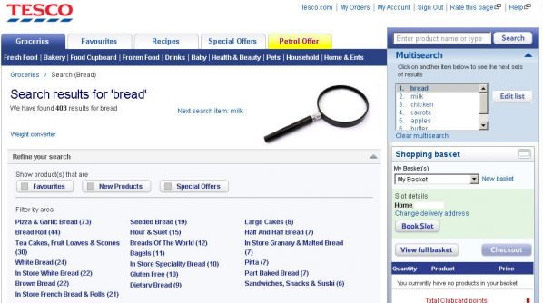
Multisearch
Other retailers have added this to their site, but what I like about Tesco’s is that it’s surfaced up front – rather than having to click to it. It allows me to enter my entire shopping list, if I wish…
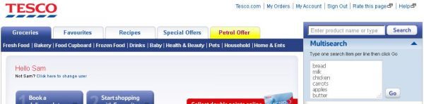
… and then click through the results.
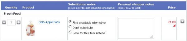
Instructions to picker per item
Great for people who are particular about some things (ripeness of bananas, leanness of meat, etc), Tesco.com allows you to put item-specific instructions. Other retailers I’ve used do have the “instructions” and “substitutions” features, but at a basket level, rather than by individual item. V. useful when buying bacon.
Basket view by category
This one’s useful when scanning for a particular item, or reviewing your overall shop. Clicking “View full basket” shows a list but separated into categories. Other retailers simply show you one big list of items, in the order that you put them into your basket (although with the size of my shops, it should probably be called a “trolley”).
There are other good features of the site, such as showing search results by favourites/aisle/offers and a “My usuals” section – but these are also present on most other sites now.
Areas that Tesco.com and others could improve on are:
Sort search results
Whilst you can see search results by favourites, etc., a really useful feature would be to sort by cost. And cost per unit (e.g. kilo, item, ml). For example, there may be a special offer on Andrex toilet tissue, but if I’m cost-conscious, then I’m more interested in which is cheapest overall – by sheet, or roll.
Remove items from search results
I’ve never yet found a retailer with this feature (comment below if you know otherwise!), but after searching for an item, I’d like the ability to remove products that I’m not interested in from the search results, thus enabling me to just have a list of those I’m considering.
Show shopping basket by category
As mentioned, this feature is available, but it’d be good to show it like this on the front screen rather than having to click to it. Having said that, I can see they’re reasoning – it’s also useful to see what items you’ve just placed in your basket. Perhaps a compromise – show the last 3 items, but everything else is filed by category. I’ll often find an alternative product, but then struggle to find my original selection for removal. And more than a few times, I’ve ended up with both.
One-hour delivery slots
I know, it’s not website usability at all. But Tesco.com would get far more business from me if they offered one-hour delivery slots. That’s actually the main reason why I don’t use them – I’m prepared to put up with a slightly poorer online experience to shop somewhere else, if it means that I don’t have to hang around for two hours in the evening.
All of these observations come back to the main principles of usability – make it easy, efficient and pleasurable. And you don’t have to be a company the size of Tesco to do that.
How have you found online supermarkets? Are there any particular features you like/hate? What makes you use the one that you do? Leave a comment below…