
Halifax recently unveiled a new-look secure area. So what makes this more usable than the previous design? And how could it be even better?
Most popular functions brought to home page
I’m guessing their site analysis has identified that making payments and transfers are the most popular activites, so they’ve surfaced these on the home page. It only reduces the journey by one click…. but I believe in the Power Of One (else, what’s the point of voting?).
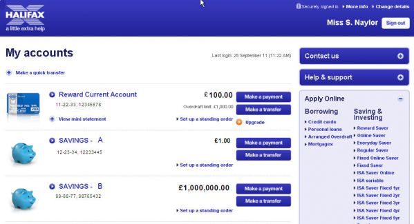
Further improvement: It’s not clear that “payments” are external (e.g. to your landlord’s account) and “transfers” are internal (so moving money between your current and savings accounts – as long as they’re both with Halifax). It’s something I need to remember each time I come to this page – and it shouldn’t be. It’d be easy for Halifax to call these buttons, say “Pay someone else” and “Internal transfer”.
Icons to distinguish different types of accounts
A cash card for my current account and a piggy bank for my savings makes it really easy to distinguish between the two at a glance.
It’d be even better if I could upload my own images… as if you’ve lots of, say, savings accounts, it’s not so “at a glance” any more.
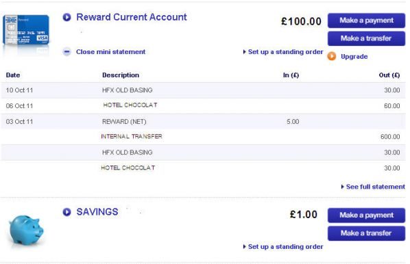
View mini statement
… brings up your last six transactions without loading a new page – the ones you’re probably most interested in. Nice. I like.
Cleaner design
Lots of white space. I like white space – it allows the page, and the user, to breathe. And it makes those bits which aren’t white, more prominent. As Debussy once said; “Music is the silence between the notes.”
Exactly.
I do think they need to review their design guidelines, though. I counted at least nine different font variants – some only very slightly different. Contrast is an important element of web design – either make it exactly the same, or radically different. Be bold. Don’t go for something that looks like you slightly overshot the font size from the drop down and didn’t notice.
Clear links to key information
Contact us, help and support, “change details” – they’re all easy-to-find and clearly labelled.
The only odd-one-out is “More info”. It takes you to a security centre, opened in a new window in a non-secure site. Hmmm.
And you would have thought that the bottom right-hand module containing links to other services would be more popular than “Apply Online”.
But you can’t begrudge Halifax a little advertising on what is, by all accounts, a usable and improved site.