
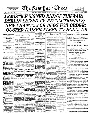
Design grids are invisible intersecting vertical and horizontal lines upon which design elements can be placed to structure 2d content. Print publications have been using grid based approaches for their layouts for a long long time. Traditional newspapers for example, have been using this method to organise their pages since the dawn of commercial printing. The development of website design considerations in areas such as content strategy and information architecture have encouraged the use of design grids online.
Fundamentals
Grid systems are commonly based around two concepts: columns and gutters. Columns are, as you would expect, vertical elements that stretch from the top of the page to the bottom of the page with a set width. Grid systems have multiple columns on a page which all have the same width. Gutters are the spacing to the left and right of each column, all gutters are the same width. Two adjacent columns are separated by two gutters.
Benefits
The biggest benefit of using a grid system for your design is to organise content in a clear and predictable manner. This creates a design ‘rhythm’ through a strong structure and visual pattern. There is also another benefit for using grid systems these days in website design that wasn’t around a few years ago.
I’ve previously written about responsive website design, ensuring that your website is accessible on devices of all sizes: from small mobile phone screens to large widescreen desktop monitors. Grid systems create scalable web designs which, when developed with responsive CSS and JavaScript, can adapt depending on the size of the viewing screen.
960 Grid System
Arguably the most famous web grid system is the 960 grid system. Named after it’s 960px width, it comes in 12, 16 and 24 column grids. The greater the amount of content on your design then a designer may choose a greater number of columns. Each column in the framework has a 10px margin on the left and right side which creates gutters of 20px.
Some websites creating using the grid system are below:
Summary
Grid systems are simply a way to layout content on your website as to structure it tidily and aesthically. Grid systems can be developed to assist responsive website design and the 960 grid system is a favourite in the web development community.