
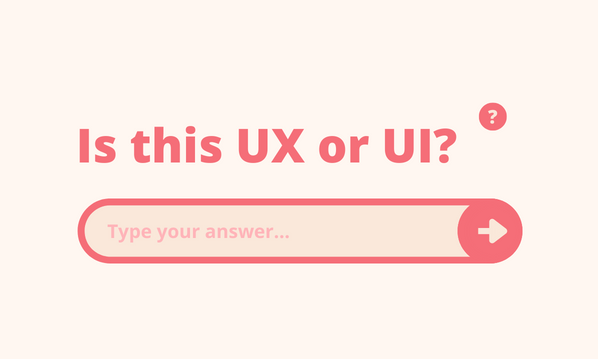
I hear ‘UX’ used to refer to everything from all-encompassing web design to the technical minutia of how a form field appears.
It causes problems. When you’re creating work that’s handed off to devs, it’s easy for people to get annoyed if they’re asking for something and you think you’re providing it – but they disagree.
The fact is: different disciplines use the same words for completely different meanings. I’m going to try to separate UX and UI into the most commonly held definitions, but that won’t beat a proper human conversation between teams.
Deciding, together, what these terms mean to your business will save you time and hurt feelings.
What’s UX?
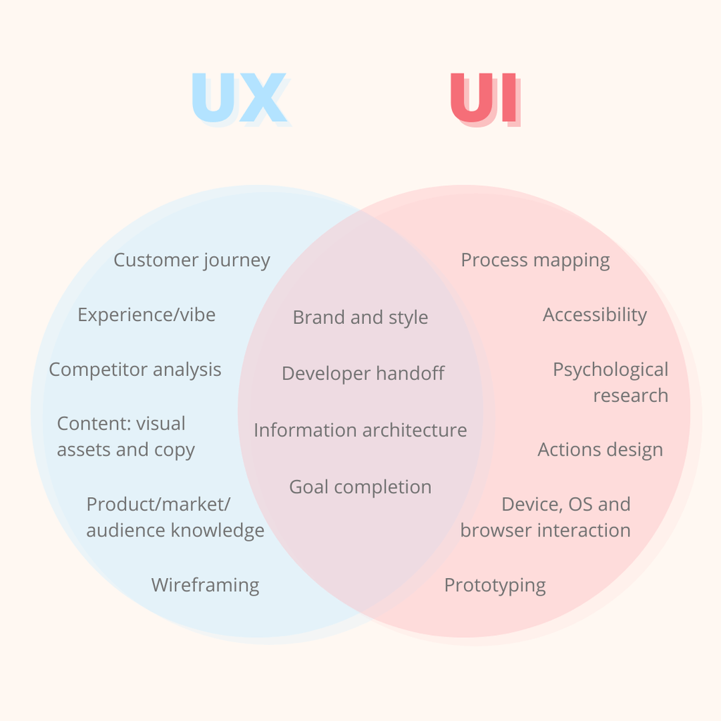
UX stands for user experience. Some view this as the overall lovely vibey FEELINGS side of digital design. Others see it as the technical pixel-by-pixel design of action-related states – but that’s actually UI design.
The feelings bit is the high-level vibe, then the technical UI bit is how that vibe is delivered in the details. It’s kind of like how we understand strategy vs. tactics – the former is the mission and the latter is the detail of how we get there.
Something that can help with UX design hand-off for developers or UI designers is writing a user experience story, to relay the feelings customers should have as they navigate.
UX story example:
As the user navigates, they should feel like there are minimal questions to answer and the journey is slick. They should feel safe sharing their information because of the consistency, quality and tone of the journey. They should be sure their task is complete at the end, and know what the next steps are.
What’s UI?
UI means user interface. It refers to any journey where the customer is inputting information. For example, a form is a user interface.
User interface design requires a lot of consistency, some psychology and a splash of guesswork. Leading users through an interface has to feel seamless and easy. Colours, states to give feedback that they’ve interacted, discoverable information and visual reinforcement are all part of this mammoth task.
UI design
UI design demands the technical bits that make a journey easy to use. A form field may seem like a simple bit of an interface, but it may require several states. These are visual clues or reinforcement that should make interacting effortless.
Example UI states:
· Inactive (not interacted with yet)
· Active (user is typing)
· Filled (information is completed)
· Error (user has missed field or done something wrong)
The best way I’ve found to make UI design easier to hand off to developers is using a design system. I use Figma as a store for all the buttons (with all their states), animations, icons, field styles and so on that they will encounter in any design. That means my team doesn’t have to produce a design and prototype for every single interaction, which can add up to thousands in a complicated UI.
Storing these UI decisions centrally also means design stays consistent. You need users to learn how to interact with you effortlessly, so keeping the visual clues the same wherever they interact with you is really, really helpful.
UI mapping
Another part of UI is the interface step-by-step. This bit is specific to each interface you’re creating, and it’s complicated. It’s a choose-you-own-adventure story with plot twists and turns galore.
One way to relay the steps is to design every move in a prototype, as mentioned in UX design. That way takes forever.
Another way is to put comments on the design, which is a helpful signal to developers but can get confusing.
To make those instructions clearer, unfortunately we need a spreadsheet. It’s a tidy, clear way of explaining ‘if this then that’ navigation through a UI. It’s also a far better audit trail than a visual design.
UI design comment example:
This field appears if the previous question is answered ‘Yes’.
UI spreadsheet example:
| Question | Copy | Field type | Answers | Interaction | States* |
| Question 5 | Are you registering as a business? | Yes/No radio buttons | Yes | Question 5.1 appears | Inactive Filled Error |
| No | User continues to question 6 | ||||
| Question 5.1 | Please select which type of business you are | Dropdown | Limited company | Inactive Active Filled Error | |
| Sole trader |
* The states of the field are the visual UI design instructions: this field requires these visual clues for the user. If we store these in a design system, a developer knows exactly what to build for each question.
How do UX and UI work together?
UX design can exist by itself, for example in a beautiful brochure website with no real user interaction. UX can also be non-digital, like packaging design.
UI design combines the technical interaction planning and the vibey element of experience design. It exists within the user experience, in a symbiotic way: a super-easy UI design feeds the overall UX vibe of a seamless experience, and a slick-feeling UX design dictates the look and feel for a super-easy UI design.
In short: UI is the structure and UX is the vibe. The fabric and the fashion? Maybe.