There is no real substitute for watching people using your website to understand how well your website user experience is working for your users.
However real user evaluations can be time-consuming and even expensive, especially if you want ongoing, continual feedback into your website’s user experience. So, to supplement (but not replace) real user testing, there are some fantastic tools available for you to get ongoing, continuous insight into how people are using your website.
Examples of usability applications
- Crazyegg
- Silverback
- Otpimizely
- Userfly
- Intuition HQ
- Morae
This article is about my experience of using one of these applications: Crazyegg.
CrazyEgg
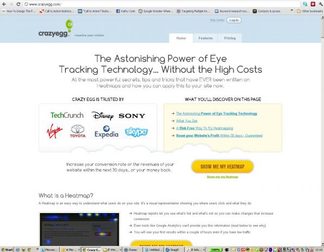
We use Crazyegg on this website. Crazyegg is relatively cheap (We have the Crazyegg Plus package which is $41 per month for 12 months) and is very easy to use. You don’t have to be technical to use this. If I can use it, anyone can. This is how it works.
1. Snapshots Dashboard
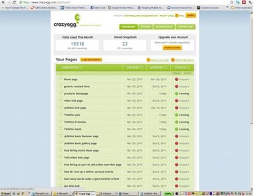
We set up ‘snapshots’ of this website. These run over either a period of time or to a specifed number of visits, or unlimited. Crazyegg captures during that time all the visits to the website – and where users click and scroll around each page included in each snapshot.
2. Heatmap
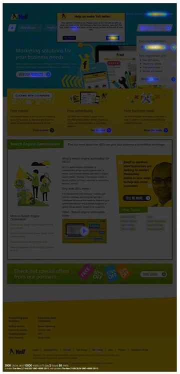
The heatmap is a picture of where visitors are clicking. The brighter the area, the more it is being clicked. The darker the area, the less it is being clicked. By showing where users are and are not clicking you can get a good view on whether or not they are using the site as you’d expect – if they are moving along journeys which support their tasks, needs and goals – and are using the part of the site you want them to. You can also compare the results of 2 different heatmaps side by side, to track user journeys from page to page.
- How has this helped? From this we have been able to see what users are (and are not) using on the site.
3. Scrollmap
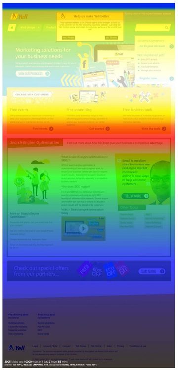
The scrollmap is based on the amount of time that is spent viewing each section of the page. The brightest areas have been viewed for the longest period of time, and the darker areas have been viewed for the least amount of time. You can get a good feel for where they are looking, and not looking, on each page.
- How has this helped? We have discovered that the assumption that users don’t scroll is not true when you offer content they need and are looking for below the fold, they are scrolling, and they are spending time looking at content lower down – because users are finding it useful. In the same way we are also finding pages where this is not happening, and so we need to do something about the content and design to better support users’ needs.
4. Confetti
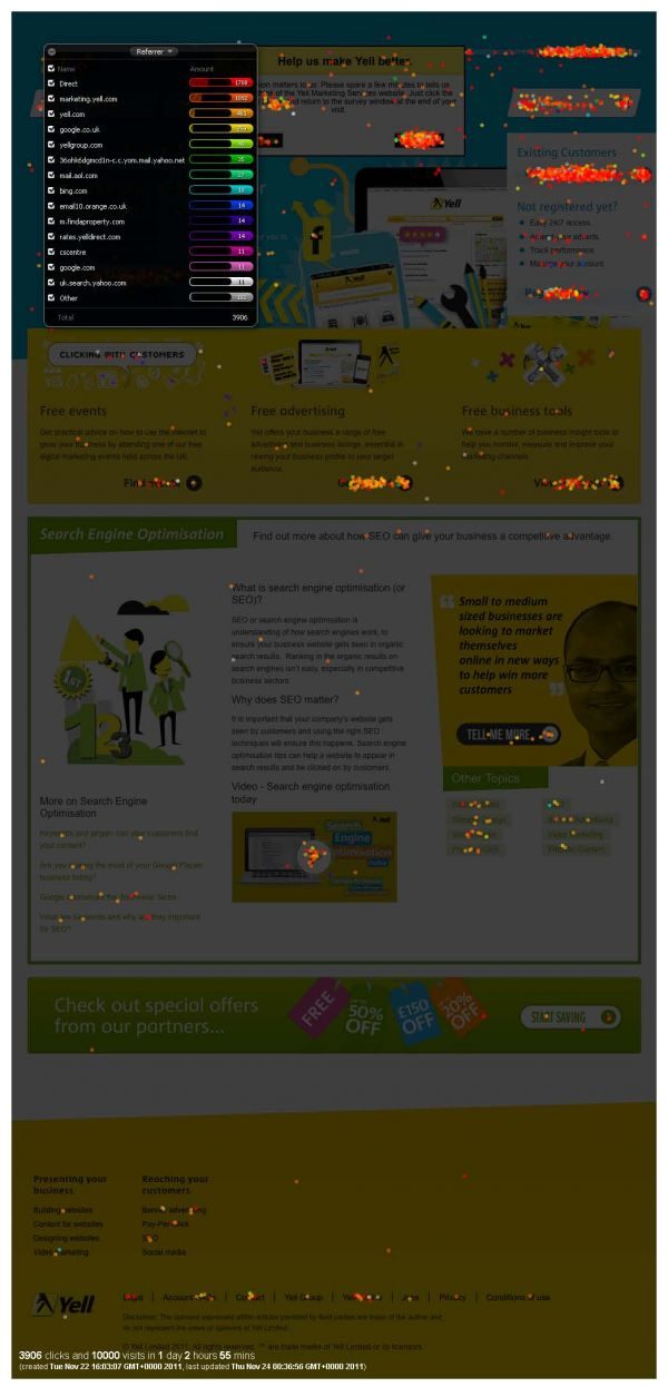
The confetti report shows you exactly where a person clicks. The dots are color coded to show you more info about the visitor – like where they have come from, Search Terms, Search Engines, Browsers they are using.
- How has this helped? From this we have been able to see where specific different types of customers are going in our site and the journeys they are taking through the site, the content and tools which are useful (and less useful) to them.
5. Overlay
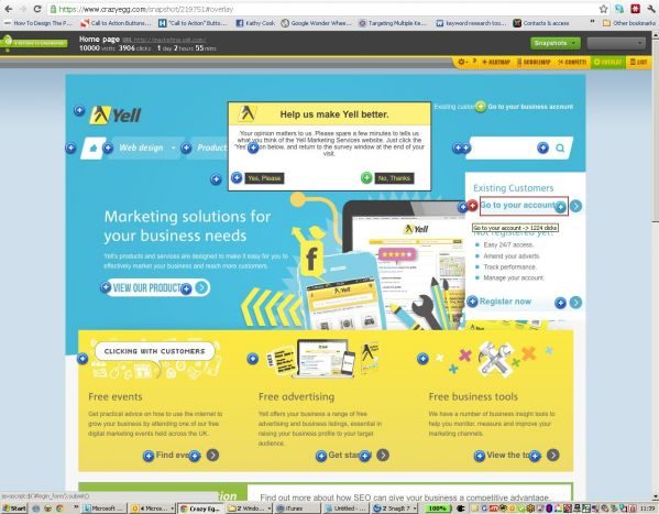
The overlay shows the specific number of clicks that each link receives. The plus sign markers are color coded from blues indicating the least clicks to reds indicating the most clicks.
- How has this helped? From this we have been able to see links which are working for users and us, and links which are not being used, suggesting to us the content and design around these needs to be improved.
6. Combination of the above
When you put each of these together for each page on your website, you end up with a good picture of what is and is not being used – and can then make decisions about how the design and content need to be improved to better support users’ needs and your own business goals.
- How has this helped? From these insights our website team have a list of more than thirty improvements they will be delivering to this website’s design and content over the next couple of months.
Crazegg is easy to use, and the insight we’ve gained from being able to see where our users are going on pages has provided evidence for investing time and resource in further improvements to the site’s content and design. Furthermore, because we continuously use this tool, once we have delivered the content and design improvements we will be able to see what difference these have made.
