On average we do a total overhaul of our website once a year. That’s not to say that we’re not tweaking away in between, but we find that to keep it fresh and maximise our conversion rates, we need a biggy that frequently.
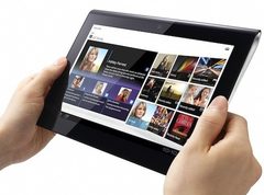
This year when we were looking around at other sites for inspiration, we noticed that website content is becoming much more tablet friendly. Whereas before you would make sure that users wouldn’t have to scroll down through pages, these days the more savvy sites are using very long pages of content.
There are a few things to bear in mind if you are looking to go down this route however…
1. It must be easy to navigate within the page
Previously you needed to have good navigation between pages, now you need to move that into the page because otherwise that precious info your visitor is after, is lost in numerous finger scrolls. Also just because you’re now tablet friendly doesn’t mean that your visitor is using a tablet, so for those people still on a desktop – it shouldn’t be a painful scrolling experience for them.
A way to address this is to add an extra level of navigation across the top or side that will jump you down to the correct content. If you can also make it travel down the page with your content (think freeze panes in excel) then that’s perfect.
2. Keep it simple (stupid)
Your screen is much smaller on a tablet so adding lots of little detail will only crown your design and make call to actions and navigation paths get lost. Although you can zoom in on pages with tablets, it’s not the best experience so the simpler the better and think finger sized buttons. Also forms can get tricky with different sized fingers so make fields large enough to click on and drop downs aren’t the greatest user experience on tablets so try to avoid these.
3. Where are you?
Bearing in mind where people are using their tablets, you may find yourself trying to figure out the best form of content for them to consume. Someone sat on their sofa having a quick flick whilst watching X Factor may want related content to the show whereas if someone is on a train or in a car, they’re dealing with constant movement so high volumes of copy could be hard to read.
You find tablet users want to be able to quickly access information without having to boot up a computer or wait for their mobile internet to find 3G so give them bite-sized information that they can dig for further info on if they want. You’re in this halfway space between masses of detail and a quick fact and you need to make sure you’re pleasing both parties.


