It’s incredible to see how web design trends spread. They start slowly, with just a few sites doing things in a new way. But soon, everyone’s at it.
Not every web design trend is for the better. In recent years, some have emerged that would, let’s be honest, be best off in the rubbish bin. Here are five – do you agree the web would be better without them?
1. Horrible stock images
This is an easy one. Can we just agree that painfully fake images have no place on a credible website? They say pictures speak louder than words, so I’ll leave these here:

Websites use stock photography because it’s a quick, cheap option. The thing is, it is possible to find original images on stock sites. You just have to search a bit more thoroughly.
If that doesn’t work, consider taking your own photos, bringing in a photographer or changing what sort of visuals you use on your website. There are plenty of options that are better than illustrating your ‘support’ page with yet another photo of someone wearing a headset.
2. Infinitely scrollable websites
At first glance, infinite scroll seems clever. As you reach the bottom of a page, more content loads to fill the gap. You never have to click through to page two, because the page keeps growing.
As many websites use it, infinite scroll has lost its initial wow factor. And there are plenty of reasons that using it is a bad idea.
For starters, have you ever tried to click a link in the footer of an infinitely scrolling page? That’s no fun at all.
And infinite scroll is bad for search engines, too. When you follow a link from Google, you should find what you’re looking for. With infinite scroll, even if a search engine has managed to index everything on the page, you still have to scroll and scroll until you find it.
What’s more, if you follow a link and then try to go back, you’ll lose your place on the page.
3. Ever more intrusive ads
It’s hard for magazines, newspapers and other publishers to make money online. Apart from a few businesses that charge for their digital content, most rely on advertising.
The problem is that users don’t want to see online adverts. In fact, we’ve got really good at blanking them out. Banner blindness makes it hard for advertisers to capture a user’s attention.
The predictable result is a mass of intrusive adverts that pop up, play sounds, and generally get in the way while you’re trying to use a website. The worst offenders even make your computer work harder, slowing everything to a crawl.
It’s not that online advertising is bad. It pays for much of the content you read and for many of the websites you use. But when users are getting so frustrated that they’re leaving your site, you need to have a rethink.
4. Home page carousels
A carousel (or ‘slider’) is the easy solution when you want to feature more than one thing at the top of your homepage.
We’ve all seen them – often they switch between items at regular intervals, and have arrows or buttons allowing users to move between the different items. The problem with carousels is two-fold:
- Carousels lack focus. Carousels make it easy to put several items at the top of your website. So instead of working out what single message your users want to see, you end up with several products, offers or benefits, all vying for attention. As you add more content to your site, you’ll add more carousel slides, too.
- Carousels can be a usability nightmare. If your carousel scrolls automatically, you risk interrupting the user’s flow as they read your page. But you can’t always rely on people to navigate your carousel using arrows, either. Without a clear indication of what’s on the other slides, why would they?
Ok, perhaps well-designed carousels can be useful in certain situations. But think carefully before you use one on your website.
5. Endless sharing buttons
We have a carefully-selected range of sharing buttons on this site. They let you ‘like’ the page on Facebook, tweet about it, ‘+1’ it on Google Plus, or share it on LinkedIn. They don’t add too much visual clutter to the page, and they don’t detract from the content.
But in the rush to achieve as many social shares as possible, it can be tempting to slap on a button for every social network you can think of:
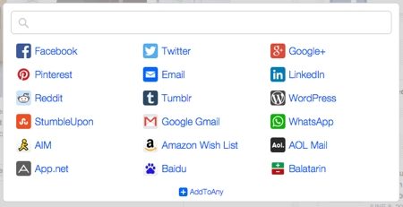
(Yes, that really is a screenshot from a real website.)
The truth is, sharing buttons don’t always get used that much. What’s more, they can distract users and add clutter to your page.
If you do decide to use sharing buttons, don’t overdo it – and position them in a way that doesn’t distract from your core content.