
Heals is a high quality retailer of home wares, with a penchant for trendy designers and a spot of retro. Their website content needs to focus on really selling the quality of their products, as they’re not the cheapest out there. You’re buying the experience and trendiness essentially.
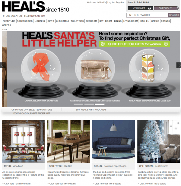
Things I like about their homepage content start with how simply laid out it is. They use lots of large images that change with trends and seasons so you can get inspired straight from the off. Heals let their products do the talking, there is little copy on the homepage and that’s ok if what you’re selling is highly visual – you don’t want to take the eye away, forcing it to read copy just for the sake of it.
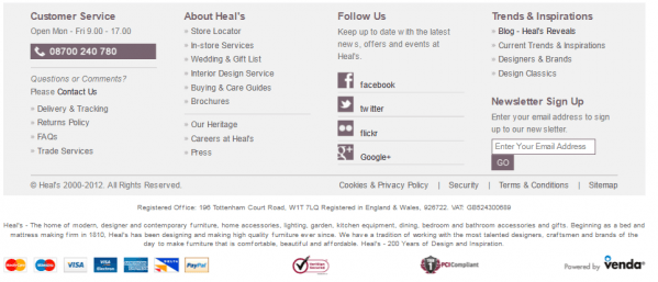
Also on their homepage they make it really easy to access important online shopping content such as addressing how deliveries are done, what their returns policy is and what cards they accept. When I’m buying online, these are all reassuring factors for me and part of my buying decision process that a website needs to address pretty quickly.
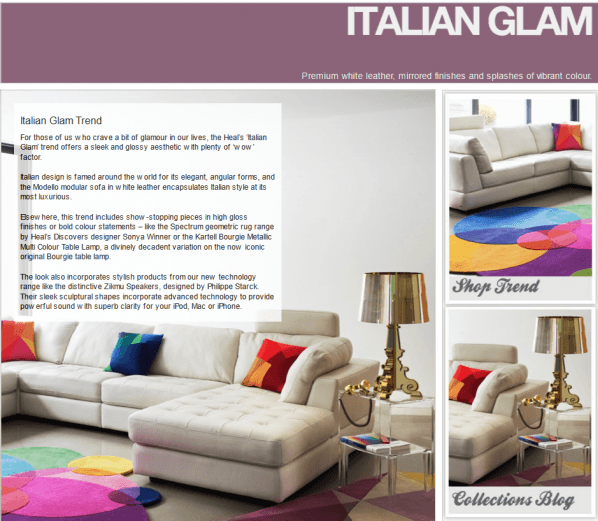
I love, love, love their trends section of the site – yet again giving people inspiration (which let’s face it when you’re forking out for designer it’s vital to have). Again the content is focussed around bright, beautiful imagery but here they are also giving you more details as to how you create this look yourself, with links to relevant products and then a whole section allowing you to ‘shop the look’. My only criticism is that the links within the copy are only apparent when you roll over them and could get lost.
The detailed ‘shop the look’ page shows off their general product page content well, what they have done here and in other areas of the site is personalised the content shown to match the ‘look’, a clever way of having everything in one place. On the left you are able to filter down your options quickly and if an item has more options then this is marked clearly.
Here I like the way that all of the product imagery is on a white background so nothing is distracting from the item itself (which is good when a rug is costing nearly £2k!).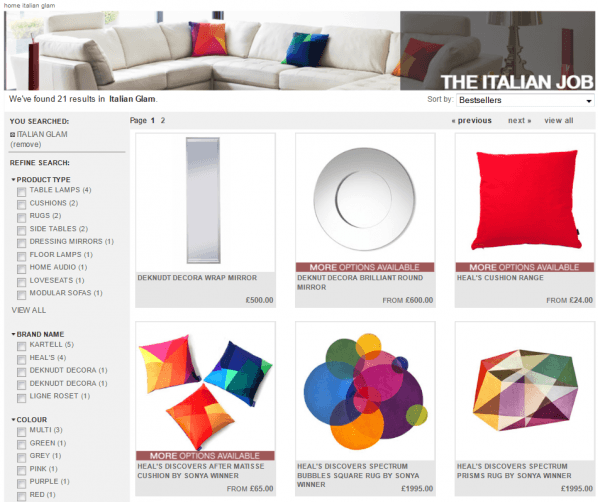
The main Heals website is a clean shopping experience and one that matches up with their email marketing content (sign up on homepage, nice and clear). Thumbs up all round once I can tear myself away from their inspiration pages…