
In the fourth of my series, where we look at websites and learn from their good and bad, I’m looking at Frugi – who provide organic children’s’ clothing. They’re not a large company but their website gives a feel of professionalism and quality, and that they care.
A couple of things that hit you about the Frugi website – their design and ability to interact with them.
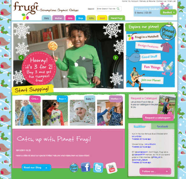
I love the way that their design and branding is playful and childlike, it reflects the product that they’re selling and will appeal to mums and dads who are purchasing clothes for their children. The background to their homepage changes with the season, which is a simple thing to implement but makes the site seem up-to-date. They also have eye-catching headings and call to actions such as the ‘start shopping’ button and the clear promo in the main image which changes between three of them.
They are very keen to have their visitors interact with them and push their ‘Planet Frugi’ which is their social sites and blog. This is clever as it will keep their visitors engaged with their brand and will encourage repeat visits and therefore purchases. Alongside the clear blocks of content and call to actions telling people to engage there is also a twitter feed and facebook feed so you can see what you’re engaging with.
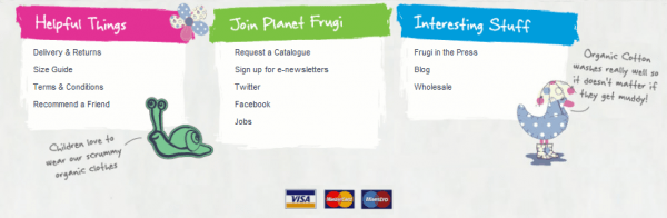
Another thing that is good about this e-commerce site is that in their footer there is information such as what cards they take and helpful items such as delivery and sizing information. Delivery does feature at the top aswell so it’s easy to find. A step further would have been to say a from delivery price so it’s more enticing and returns policy to allay any fears.
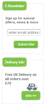
Once you delve deeper into the website you get some nice information boxes on the left-hand side – again pushing interaction with the brand and more information on delivery. An e-newsletter sign-up is very beneficial to a retailer as you can then send promotions once they have left your site and use it as a way to get visitors back for a purchase. They’ve made it simple to give an email address which is good as once banked, even if they don’t fill out any further information the newsletter can reach them.
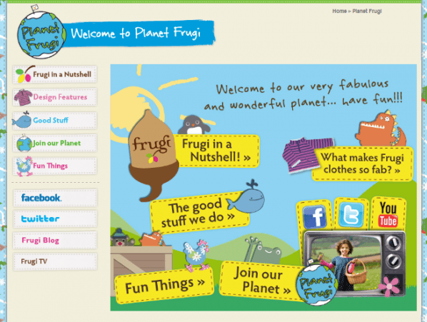
The final page I’m reviewing is their Frugi Planet page which again shows how interactive they want to be with their customers. It is friendly and encouraging and will tie people to the brand for their obvious caring values. They’ve used video which is a great way to show off their clothes and there are even things for the children to get involved with.
 Conclusion
This is a lovely e-commerce site and having received their emails aswell I can say that they follow through on their engagement and encourage purchase for their high quality clothing range. For a small business this is a good example of how your website can do good things with a small number of pages.