Groupon, the first daily discount voucher site that really made it huge, are a bit like Marmite. Some people love them due to the money off they can get and some people loathe them due to problems with reliability and endless emails in their inbox.
What you can’t deny is that although their discount vouchers were nothing we hadn’t seen before, the way they offered for one day only and the offer only went live with enough interest made discount vouchers a big thing again.
I’ve just bought a weekend away for my anniversary off them so thought it a good one to review this month, so how does their website content fair?

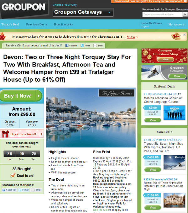
Firstly they are very clever with their content, one thing a lot of people struggle with is where to find lots of interesting content that can be updated regularly. Groupon are able to update it every day with a new range of offers but they usually stick to two – which helps keep people coming back for more.
They are able to get their content straight from the provider of the offer, so there is little work for them to do – I would expect that when an offer is submitted it is using a template that means they require no editing either.

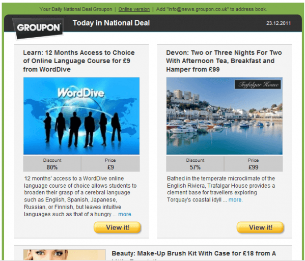
Again their emails require little manual intervention, they use a set template that simply pulls blocks of content through from a webpage, which makes the journey from email to website feel very on brand and continuous, important for those all important conversions.

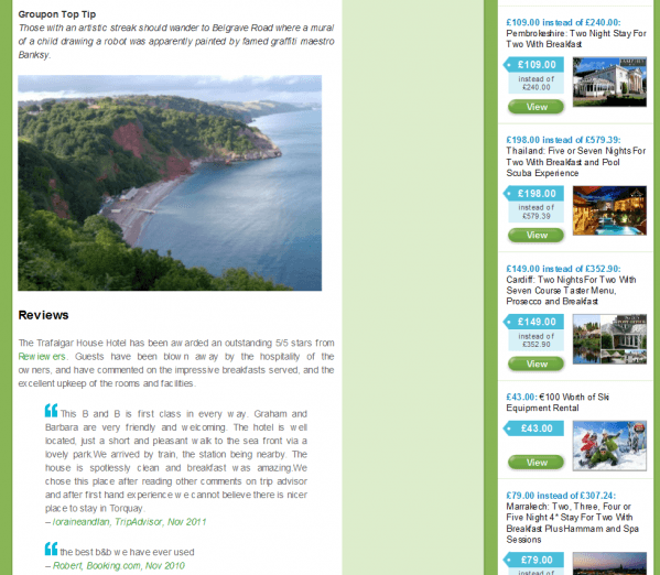
Finally Groupon have embraced the scroll! For years we’ve been told that website visitors don’t like to scroll down and content should be kept above the fold. With touchscreen technology and the visitors wanting to see as much as possible to make an informed decision it is now ok to have them scrolling down to read your content. For SEO purposes it’s recommended that each page has at least 200 words per page and as long as that is relevant content to the reader, they will happily scroll through it. With Groupon I did 8 scrolls to hit the bottom! The key? Dot your call to actions throughout the page and make it easy to get back to the top with a link at the bottom of the page.
Summary
I’ve only picked some highlights from Groupon but they are relevant to any sites unsure as to how much content to put on a page or how to keep content frequently updated. Take a look through their site as they are good at call to action buttons and also tempting people with deadline reminders and other relevant offers.


