Half term has just been and gone and we’re not long until Easter so for this month’s ‘learnings’ I thought it apt to look at the travel industry.
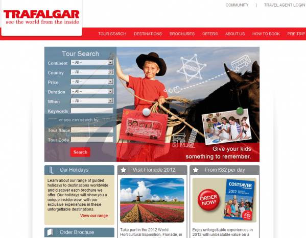
Trafalgar UK is a travel agency that is a leader in guided holidays and tours. The first thing I like about their website content is that it looks really clean, despite fitting a lot of information on the homepage. They also have a really clear search option that means people can get stuck straight in without having to click away from their landing page.

Their top navigation is almost secondary compared to the main content of the website. Trafalgar use nice images and clear headings that draw your eye to where they want it, not leaving you to wander through their top navigation. This is actually quite rare on websites; brands can get a bit lazy and expect their visitors to follow the well trodden path of top nav, in order to find content they want.
Another nice element to their website content is the ‘useful links’ box they have at the bottom of each page. Ok so it’s the same links throughout the site but I like how easy they are making it for people to find content – they’re really thinking from the visitors’ point of view and not just their own.

The final element of the Trafalgar site that I wanted to point out, was their ‘Pre tour’ page, which is accessible from the main navigation.
This page has some great content on it and it’s not salesy, it’s just really useful and relevant to their visitors. You could say that this area is the added value part, what sets them apart from other tour operators. Visitors can meet other travellers in their forum and discuss plans and itineraries or they can read destination guides and find out how to express checkout – these are all things I would want to know before I travelled.

In summary I think Trafalgar have a nice site that is simple to navigate and contains a lot of useful content to their visitors. The design is colourful yet simple and appealing to all ages. A site well worth looking to for ideas…


