
How to promote your business
Are you looking to promote your business online? With more people turning to the internet to find local businesses, having an online presence is essential (especially in the current climate). In this article, we look at the steps you can take to build your online presence.
1. Create good quality content
Regular and relevant content that is of interest to your customers will not only showcase your expertise; it will also put you on their radar as a trusted provider. Find out what their most common questions are and answer them in your content. There are various ways you can go about finding out what questions people are asking, including:
- Asking customers directly (e.g. in person or via email or social media).
- Researching posts in forums or on social media.
- Keyword research.
Also, don’t forget to let readers know what you want to do next with a clear Call to Action. For example, do you want them to call you to book an appointment, download an information guide or read an article on your website? A good Call to Action will increase the chances of people sticking around to engage with your business.
Blogging is a quick way to get started with content creation, as you can post blogs directly on your website. If you already have a company blog, consider updating and refreshing your existing content. Doing this can help keep your site relevant in search results; it also shows people that you keep up to date with changes in your industry.
Advertise your business online
These days, it’s often not enough to rely on traditional print and broadcast advertising to get people to hear about your business.
Online advertising offers a targeted, low-cost way to let people know what you do – and to drive traffic to your website, generating sales and leads.
2. Banner advertising
Banner advertising is a popular way of advertising online, by creating eye-catching block adverts that appear above, below or to the side of the main content on websites.
When clicked on, the banner advert brings traffic back to your website to find out more about your offer. Banner adverts are particularly effective if they use a special offer to encourage readers to click.
3. Pay-per-click and search engine optimisation
PPC and SEO both work to help web users find your website through search engines.
SEO is a way of optimising your website so that search engines can find it and rank it in their results pages. PPC means paying for adverts on those same results pages; to boost the results you get through SEO.
4. Social networks
One of the golden rules of marketing is to ‘be where your customers are’. With the popularity of social media, advertising here lets you stay in contact customers and prospects in a way they find engaging.
By interacting with your target market through a social media profile, you can create a two-way discussion that lets you get your name known while finding out more about customer needs. Reward ‘fans’ with special offers and exclusive content to give them a reason to follow you.
You can also create ‘social adverts’ that appear in users’ news feeds.
5. Content marketing
Content marketing works by creating truly useful content that addresses customer needs – for example, giving insights into an industry ‘hot topic’, answering common questions or presenting facts in an entertaining way – and encouraging people to share it around.
Content produced for this purpose needs to be informative, entertaining and attention grabbing. Above all, it needs to be customer-focused and not simply a sales message.
Video marketing is one form of content marketing, using short, engaging video clips.
6. Online advertising and lead generation
Although online advertising helps raise awareness of your business, don’t lose sight of the fact that the aim of all your marketing efforts is to generate sales.
When you create your advertising, think carefully about what you specifically want to achieve with it – do you want viewers to sign up for a free trial, take advantage of a special offer or add their details to your mailing list?
Make sure you build in a clear call to action that will get the message across and encourage people to take that step – and always measure your results, so you can be sure you’re getting a return on investment.
7. Set up a website
Your website is the virtual shop window to your business. It is where people go to find out about you, what you offer and more importantly, how you can help them.
A good website increases credibility and can help your business stand out from competitors. It is also an opportunity to bring more enquiries into the business as you will have (hopefully) provided them with your contact details.
However, building a website can be rather time-consuming, and sometimes, a bit of a technical minefield. Besides how it looks, other things you need to consider include:
- Creating content that speaks to your customers.
- Choosing the right images that work well in the context of your website, brand and content.
- User experience (how easy it is to use and navigate your website).
- Mobile friendliness (a website that is compatible on mobile devices as well as desktop).
- Search Engine Optimisation (SEO) – so people can find you online.
If building your website (or the idea of it) is giving you a headache, the good news is that there are plenty of professional web designers and copywriters out there who can help you.
Here at Yell, we create professionally designed and optimised websites powered by the leading web development platform Wix, with the option to choose from advanced features such as eCommerce, bookings, reservations, ticket and event management and more.
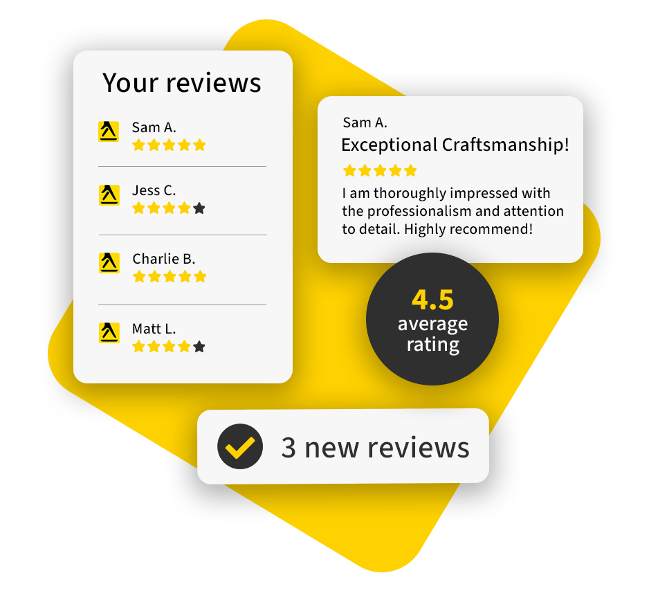
8. Build trust online – list your business on review sites
With the internet in our pockets (quite literally), it’s easier than ever to search for a local business. Online reviews play a pivotal role in purchase decisions, making them the new word of mouth.
People often visit established review sites for reliable information about a company. Therefore, it makes sense to have listings in those places.
Examples of review sites include Google My Business and Yell.com. Then there are industry-specific sites such as TrustaTrader or TripAdvisor. It’s worth taking some time to find out which ones are most used by your customers, and therefore most relevant to your business.
When setting up your profiles, remember to add your location, as this will help local customers find you.
9. Claim your free listing on Yell.com
A Yell.com listing comes with benefits such as being listed on Amazon Alexa, Apple Maps and Bing Maps (dependent on eligibility). You also have access to the free Yell for Business app, where you can activate the free Yell Messaging service so potential customers can message your business directly from places like Apple Maps, Facebook, or anywhere where your phone number appears online.
10. Get social – set up your social media profiles
Social media allows you to engage and interact with customers online, building awareness and trust in your brand.
There are various platforms to choose from, depending on your business. Find out where your customers hang out and build a presence there. The most common platforms include Facebook, Twitter, LinkedIn and Instagram.
Whichever platform you choose, make sure you:
- Post regularly (not just promotional stuff).
- Reply to comments and questions.
- Thank customers for their support.
User-generated or third-party photos, videos, reviews and other social media content related to your business can be both a gift and a threat.
On the one hand, your customers are creating content for you – great right?
On the other hand, you don’t have full control over that content – so how can you know if they’re going to share something in a negative or a positive light?
There is always a way to give your guests and web visitors the power to create their own content or share your content for you. You can steer them towards producing a positive on-brand piece of content.
11. Encourage users to share your business
Here are a few other great ways that you can give your website visitors and customers the opportunity to create and/or share content for you:
- Give visitors a good online experience. Having a user-friendly website is a must, not an option. If potential customers have an easy time navigating your website, and your social media presence and reactivity to enquiries is good, they will have a positive first impression of your business. Building on this, populate your website and social channels with relevant shareable content, so that even if they don’t create their own, it’s easy for them to share yours.
- Create content your audience would be proud to share. Not all users will have time to generate their own content, so why not create it for them? Each time you devise a new piece of content, ask yourself: would you share that yourself if you saw it online? People only share content that really impresses or entertains them (and therefore might impress or entertain their own followers), so bear this in mind when planning your content.
- Vary content formats. This could be an embedded video on your home page, a detailed infographic, or simply an amusing GIF. If the content is on brand, you can provide your online audience with lots of different formats and themes to choose from.
- SEO every piece of content. This means naming and tagging images and videos appropriately, and researching keywords for written content, to give your content the best chance of being found. Above all it means creating stand-out content that people want to read – search engines prioritise quality.
- Brand all your content. Make sure you get the credit for your content, and that new viewers see your company as the initial creator. Watermarking your logo onto images and videos is surprisingly straightforward.
- Enlist supporters to spread the word. Business partners, suppliers, former customers: all these supporters are a resource you can use to extend the reach of your content. Tag one or two relevant key accounts in your social media posts – if the content is also relevant to their followers, they’ll likely share it.
- Provide physical props. If you have a physical venue like a shop or restaurant, give visitors appealing props with which to create their own content. For example flower walls (or doughnut walls!) make a great creative backdrop for photos, and ‘selfie points’ are a reminder for people to take photos of their experience with you (don’t forget to print your logo, handle and hashtag on any signage). Attractive décor can also set the scene for a photo, especially quirky signs and unusual furniture.
- Make it easy for them to tag you. If they’re going to promote your business for free, the least you can do is give them the information they need to create their social media post. Make sure your logo, social media handles and hashtags are prominently displayed on your website and if applicable, in your shop or place of work.
- Encourage reviews of your business. Online reviews are great user-generated content that often directly influence new sales – people like hearing first-hand accounts of a product or service before they commit to purchasing themselves. However, most people won’t bother to review your business unless you prompt them and make it easy for them. So, if most of your customers buy from you online then why not email them post-purchase to ask them to leave you a review? If they purchase in store, pop a little ‘How did we do?’ feedback card in with their item.
- Syndicate content through all channels. Don’t rely on people making the effort to visit your website to happen across your cool new infographic – share it far and wide through email, social media and even the press if you think it’s newsworthy enough. If you’re really hoping to make a piece of content go viral, put some money behind it – boost a Facebook post or pay for an advert.
12. How to advertise your business offline
Let’s go old school and look at some traditional small business advertising.
Let’s look at five traditional areas where you could advertise, and the pros and cons associated with each.
- Newspapers. Local newspapers can offer a wide variety of options when it comes to advertising. You can choose the ad size, and the amount of colour used to manage your budget. They also give you a very definite local area that can be targeted. However, newspaper readership is in long term decline, and you must make an impact with a single block of image and text. This means the cost per lead generated can be quite expensive. BUT if you are targeting an older audience, they are disproportionately likely to still read a local paper and so this may be just the kind of tool you need.
- Billboards. Like a newspaper advert you have just a single block to work with but unlike papers they are visible to whomever walks or drives past. A local business can make a big splash in an area with just the right billboard, but that means having it carefully designed. You also must consider the printing costs and cost of the board location itself. It can be a very effective way to advertise but requires thought and investment.
- Radio. Every town has its local radio station. Some have several. The growth in digital radio stations (both on and off-line) means there is a huge variety of stations to choose from. Production is often very cost effective, and many stations run packages that allow you to have tight control over cost of airtime. You may also be able to target specific listener groups by using timed broadcasts on specific stations. Radio may be old school, but it can be targeted and cost effective. What more can you ask from an advertising medium?
- Mailshots. When was the last time you read a leaflet that came through your door? Have you ever? Did they go straight into the recycling, or did you enjoy the sound of putting them through the shredder first? I’m being facetious. Targeted and personalised mail can be effective but the systems to create personalised mail shots to many people are expensive. Sainsbury’s send a personal letter to hundreds of thousands of customers every quarter, but they have access to data on everything you bought from them in the last three months. No wonder we get letters that tell us just exactly what we were wanting to hear. For us mere mortals, mailshots can be an expensive way to build awareness.
- Television. Most small businesses never consider television advertising. Often, they fear it is far too expensive. They may also believe that it is only for a national audience. When we think of TV adverts we think of the huge national campaigns. The rise of local television stations is changing that. We can now afford to reach our local areas through their televisions. The question we need to ask is how many of our potential customers are watching? Fortunately, many local station managers and owners know we are cautious. That means that advertising prices are low. They can be lower than your local radio station. We also get the added benefit of reaching our audience with a truly visual message.
The overall objective of advertising is that you reach a relevant potential customer base, regardless of where or how. It doesn’t matter how you persuade them to buy your products or use your services, it only matters that it is cost effective. Now we know some ways of getting our business known we must ask what we want our business known for? Let’s take a look at how you can build a good reputation for your business.
This article is provided only for general informational and educational purposes. It is not offered as and does not constitute legal or other professional advice on the subject matter in question. You should not act or rely on information contained in this website without first seeking professional advice on the subject matter in question.

Can an agency help?
Want to work with a marketing agency that has 50+ years of experience in helping local businesses to grow, and the 5-star reviews to prove it?
As part of our all-in-one digital marketing solutions, Yell’s experts boost the visibility of your business on social media to generate awareness, interest, and leads. Interested? Get in touch with us today to discuss how we can help you!


