Colour is incredibly important to people, part of being human means that our nervous system requires input and stimulation to stop us becoming bored. Colour is a major factor in that, it invokes emotions, stimulates the brain and it also helps with recognition (colour increases brand recognition by up to 80%).
[bctt tweet=”Colour can increases brand recognition by up to 80% #smallbusiness #webdesign”]
If you think of some of the big brands today, they keep their colours consistent and so that they are easily recognised – think of the purple used by Cadbury, the Coca-Cola red cans, or the bright yellow used by Yellow Pages and Yell.com. If McDonald’s suddenly changed their big ‘M’ logo to blue then it just wouldn’t be the same, people wouldn’t recognise them.
 It is essential when choosing a colour for your business and website that you get it right. You might be tempted to pick your favourite colour, or something obvious (e.g. pink seems to often be chosen for female facing sites) – but it’s worth considering how your audience will feel with the colours you’ve picked. Pink might be pretty, but it is a bright and energetic colour which won’t be very useful if you’re trying to portray tranquillity and calm.
I’ve seen many ‘heated discussions’ over what colour a website or brand should be, everyone has favourite colours and they are quite passionate about them, this just shows how much emotion colours can bring out. You’ll never be able to please everyone and you probably won’t be able to pick a colour that will fit every visitor of your website, but you should look at your audience and see what will work best as a whole.
The three types of colour
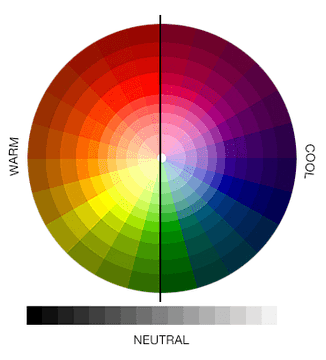 Cool – These can have a tranquil and calming effect. They can also be extremely professional, but can sometimes be a bit cold and unfriendly if not teamed with a brighter or warmer colour. Examples: blue, purple, green, turquoise
- Warm – Friendly and exciting, but can also be over-stimulating and aggressive. They sometimes need to be toned down with neutral colours. Examples: Red, orange, yellow, brown
- Neutral – On their own they can be quite drab, but teamed with cool or warm colours a neutral tone can complement any colour extremely well. Examples: black, white, grey
How to choose colour
The colour you choose should be influenced by your audience and how you want to appear to them.
- Work out who your target audience is
- Find out what colours appeal to them
- What do those colours convey emotionally? Which is most in-line with how you want to be portrayed?
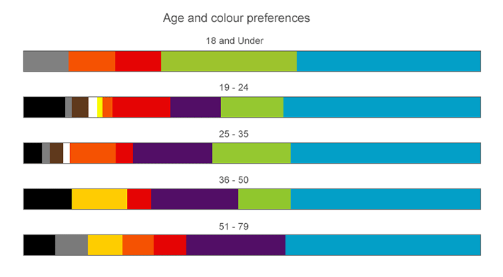
There is an excellent study on favourite and disliked colours in various age groups and across the genders. For example if you look at the diagram below you can see that the colour green is much more popular with a young audience, whereas the older generations tend to prefer purple. Blue is always consistently liked by all age groups and genders, it raises feelings trust, security and dependability, which explains why so many businesses use a blue colour scheme. Bright colours such as orange and red are favoured by the younger groups, and disliked by older generations.
There is an excellent article here: http://www.colour-affects.co.uk/psychological-properties-of-colours that talks through all the psychological properties of the colours – positive and negative, plus some interesting facts about colours. For example, the website tells us that “being the longest wavelength, red is a powerful colour. Although not technically the most visible, it has the property of appearing to be nearer than it is and therefore it grabs our attention first” – so that’s why red is used for alerts and danger – but also sale signs where they want to grab your attention quickly.
Colour really helps
Using the right colours in the right way can improve readership by 40%, learning from 55% to 78% , and comprehension by 73% – these really are significant figures, bet you didn’t realise colour was so important!
It’s not just the colours you use, but also how you use them. For example, if you have an online shop the most important thing is to get customers to buy products from you, so the ‘Buy’ buttons should be in a visible and appealing colour, they should ideally be the one item that stands out the most on every web page. Similarly if you have any call-to-actions on your website like a mailing-list sign up button, or an instruction for people to call you – these should be big, bold and colour-wise they should stand out.
What colours will you choose for your website? and, most importantly, why?


