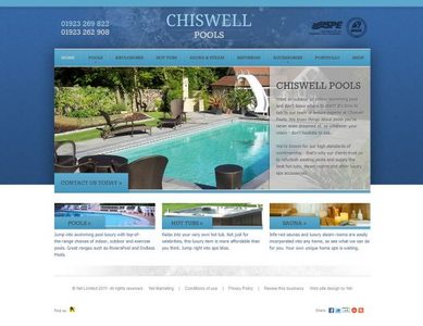
The next star small business website user experience is Chiswell Pools. This is another great example of a UK small business website which has really thought about its customers.

The good user experience of the web site design comes together from a combination of different elements of the user experience working well.
The visual design of this site is great, with a lovely balance of colours which help to enhance the overall brand and products with the dominant use of blue.
It also has a very clear persistent navigation from the homepage so users won’t get lost using this site.
The fantastic use of imagery throughout plus features such as the gallery really showcase their products.
They have also got an online video on their contact page which also works well to communicate what they offer.
The good user experience elements in this web site design include:
- A clear homepage which means users will immediately know what this business is about and what they offer.
- A visual design which creates a strong brand identity.
- Simple to use drop-down menus with obvious functionality.
- Good utility – the right information and functionality is presented at the right time.
- Shallow site structure, everything is within a few clicks of the homepage.
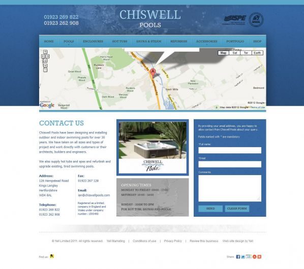
- Clear contact details at the top of the page, plus an online contact form with map.
- Clickable objects and areas are very clear, making it feel easy to use.
In total they have a site which is easy to use, efficient, useful, simple, and has functionality with good utility. And it feels unique to their brand. In other words it has good usability and a good user experience. Users will quickly and easily be able to evaluate who they are, what they do, what they offer, where to find them and how to contact them. They have clearly thought about the user when they have built this site, and how the user’s main goal would be to evaluate what they offer, so their website forms a very effective product showcase, and helps people to recognise their shop for when they visit.


