I’ve previously written a simple article about the traditional form elements available to web designers but that’s not a comprehensive list of everything you should include on your web forms. There are a number of key components which will truly engage your users, improve accessibility and conversion resulting in happier users.
1. Client side validation/errors
I’m a big fan of client side, real time validations on input fields that show you when you’ve made an error on the form as you are typing. Having it real time will mean that the users are less likely to have submitted bad, invalid data. When designing these error messages make it obvious that something has gone wrong, e,g a red cross, a change in field colour etc. Also include a message which tells the user what they’ve done wrong, from a user perspective it’s incredibly frustrating to be told your doing something wrong without being told specifically what you’re doing wrong.
2. Labels
Labels are fundamental in form design for web accessibility, SEO and usability. How is a user going to know what an input field is for if you don’t tell them? Labels should be positioned close to the field they are referring too: either above, to the left or to the right of the field. More commonly we are seeing labels written inside the fields but this produces other usability issues that I won’t discuss here.
3. Fields
Without inputs field you don’t have a form at all. A common misconception is that fields should be as long as possible but studies have actually found that this can hinder usability. A user looking to enter a CCV code during a checkout process knows they are only to enter a three digit number, a field much longer than this can cause the user to rethink how many digits they need thus slowing down the entry process. Size the field according to the data you are looking to gather.
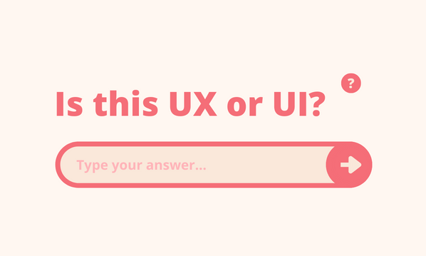
4. Action
A clear call to action is helpful . The value on the button should be descriptive of the action that the form performs. For example, imagine you have just moved house and your home address details on your online banking need changing to reflect this. The form has a button at the bottom that says “Submit”. “Submit” is an ok message, people are generally familiar with it and they understand that it will submit the data in the form but isn’t very user friendly. A better term would be “Update” or “Save” since you are updating/saving your home address.
5. Help
Where would be without the humble help text? – no where, that’s where! Despite all out efforts to make our forms obvious, easy to use and trouble free, there will always be some users who need a comprehensive guide for just filling in their name! In all seriousness we all need a helping hand now and again and help text is a great way to assist users.
Depending on your available space first provide the user with more information about what to enter in the field, next explain to the user why and how you will use the data and thirdly for more complex form elements you may have to explain how to use the UI pattern (if you feel you have to use the third point then maybe you need to reconsider the UI pattern). Help text can be hidden in a variety of ways and doesn’t need to be shown to the user unless they don’t want to see it.