Why we’ve redesigned our website
We’ve redesigned this website to improve the user experience. It’s just gone live. What do you think? We’d love your feedback. Let us know what you think about this new site, using the new ‘comments’ feature . If you saw the old site, tell us what you think about this new site compared to our old site. If you’ve got suggestions about how we can improve this one, we’d love to hear them.
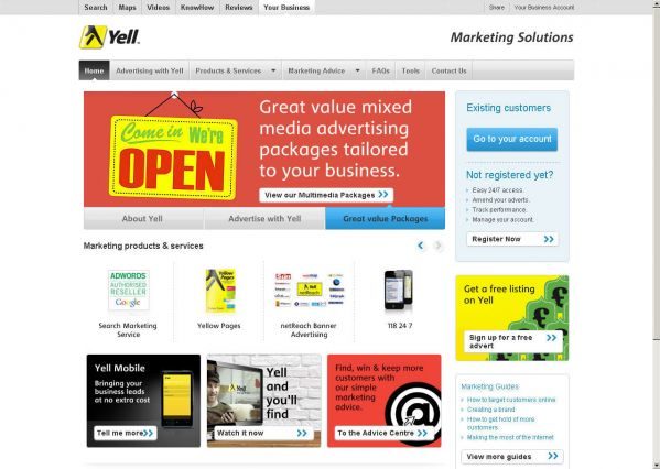
Yell’s old marketing site

We launched the old site in February 2011. It took us 8 weeks to design and build the website.
The good bits we liked:
- Simple
- Free valuable marketing advice (in PDFs)
- First place promoting all our products and services in one place
- A clear link on the homepage for customers to log in to manage their account
- Made it easy for customers to sign up for free advertising with Yell
- Comprehensive product information
The bits we weren’t happy with:
Hands up, it had some problems. We did some usability testing on the old site with small and medium-sized business owners and their employees – our target audience. Our users told us about the old website:
- The site was too frustrating to use
- Advice was too static and wasn’t updated often enough
- It didn’t work for mobile, like iPhones and iPads.
- People couldn’t find it on Google if they were searching for ‘web design’ or related topics
- Too difficult to discover free marketing advice (and once they’d found it they thought it was very valuable)
- No site search was a problem
- Navigation was too confusing
- acked social and sharing features
So, in response to this feedback from our users, we redesigned our marketing website.
Your feedback
This was a user-centred design project. The feedback we got from users during the design process helped to shape this new site design. But the work doesn’t stop with the site going live, this is just the beginning. So, we’d love to hear your feedback about the new site, what you think can be improved, suggestions – tell us here in the comments, or contact us to send us your feedback.


