Let’s face it, the web is big place and it’s all too easy to get lost and distracted from the task at hand (we’ve all ended up watching videos of cats on YouTube). Navigation through your website or app is fundamental for a couple reasons:
- Direct your customers to the end goal e.g. buying your product
- Prevent your customers getting frustrated while trying to find something.
The humble hyperlink is key to a positive experience while navigating websites. They can visibly show where a user should go to next, where the user has already visited and, most important on busy webpages, what the user is clicking on. Because of their multi-purposes, hyper links have a number of states and the design of hyperlinks whilst they are in each of these states should not be overlooked.
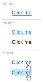
Hyper link states
There are a total of five different states that a hyper link can have: normal, visited, hover, active, focus. This article will concentrate on normal, visited and hover states as these are the most common and, in my opinion, the most important.
Normal state
The majority of links that a user bumps into on their travels around the web are in the ‘normal state’. This state describes links to web pages that the user has yet to visit. Due to their abundance, it’s key to get the design of these links right.
They need to stand out from the rest of the content on the page and the style needs to be consistent across your website, not blue links here and yellow links there, they should be blue everywhere.
Browsers display normal state links, by default, as underlined and blue which has been a convention since the web was first created over 20 years ago.
Visited state
How frustrating is it when you click on a link only to find it’s a webpage that you’ve already visited? Clearly designing links to pages that the user has already visited provides them with a way to see where they’ve already been. The visited state shows the user which links they have already clicked on.
The most commonly used visited state styles include changing the shade of colour from the normal state or changing to a less vibrant colour. The styling of visited links should be similar to your that of normal state links with a subtle change, nothing too dramatic.
Hover state
Cluttered and confusing web pages cause friction in the user journey and should be avoided where possible. One technique for preventing this is designing the link hover state as to show users which link they are hovering over with the mouse.
Commonly used hover state styles include underlining the link (or removing the underline if the normal state has an underline), changing the text colour or changing the background colour.
Final Comments
Notice in this article how I’ve not mentioned anything about changing the font size of the links. This is unconventional and you’ll rarely find designers using it as a method for differentiating between link states. The differences in link state should be kept simple and avoid changing too much from the normal link styles.


