Web accessibility for your web site is not difficult
Consider the following guidelines in your website’s visual design. A good web site designer will already be fully aware of these and will only produce web design ideas which consider web accessibility, but you can always take these as requirements to your designer to be certain.
The guidelines
Following these guidelines will make your website accessible to a wider range of people with disabilities, including blindness and low vision, deafness and hearing loss, learning disabilities, cognitive limitations, limited movement, speech disabilities, photosensitivity and combinations of these. Following these web accessibility guidelines will also often make your web content more usable to users in general.
A nice summary by Karl Dawson on web accessibility guidelines can be found at: http://www.thatstandardsguy.co.uk/2009/01/wcag-20-and-the-visual-design/
Use of colour
Make sure that colour is not used as the only visual means of conveying information, such as showing an action, prompting a response, or making a visual element stand out. The rule of thumb is to never use only colour to convey information (so a green button marked OK is better than a green circle).
Contrasting colours must be provided for navigation elements and elements which hover or focus or are active in some way. Bear in mind that adding colour enhances usability so try to use it correctly rather than eliminate it. There are free simulators you can use to check the contrast of your colour scheme which are well worth trying:
Free simulator for colour blindness: http://tech.groups.yahoo.com/group/racun/message/64
What does this mean for your customers?
About 6% of the UK population suffer from colour blindness.
The following web site page looks like this to someone who isn’t colour blind:

This is how they would look to someone who is colour blind:
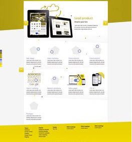
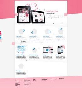
In this example the contrast between elements is sufficient for the user to still be able to see, read and use the content on the pages. In other web designs however this may have a catastrophic affect on the user not being able to see or read the content, making the site unusable.
- Minimum contrast
The visual presentation of text and images of text needs to have a contrast ratio of at least 4.5:1.
- Visual Presentation
Blocks of text should not be wider than 80 characters. This isn’t just a web accessibility rule; it makes your website easier to scan for everyone. Imagine reading a newspaper with the text spread fully across the page, you’d find you’d lose your place and give up reading a lot quicker than when text is broken into chunks and columns. The same applies to websites.
- Text is not to be justified (aligned to both left and right margins).
This is harder to read than the rest of the text on this page because it is justified. Instead line spacing needs to be at least space-and-a-half within paragraphs, and paragraph spacing to be at least 1.5 times larger than the line spacing. This makes your site easier to read. This isn’t just an web accessibility guideline, if people are squinting trying to read your website and getting a headache from trying to read your copy, you won’t get your messages across, and users will leave your site frustrated.
- Protect against seizures
Make sure that pages on your website will contain no elements that flash more than 3 times in any one second period. If you have bits which flash more, you risk someone using your site having a seizure.
- Consistent identification
Components that have the same functionality within a set of web pages are consistently identified. This isn’t just an web accessibility guideline, it’s good for all your users as they will recognise similar components more quickly, making your site easier to use.
- Large clickable areas
Navigation elements must have a large clickable surface area. This isn’t just a web accessibility guideline. If you make elements too fiddly to use, your site will be harder to use and more frustrating for your users. This is because our hands do not move with a mouse very precisely. A large clickable area makes it easier to hover the mouse cursor over the link.
- Saying it in words
A visual design is providing a visual structure which has to be translated into semantic, or words, as well. The same applies to visuals which affect interaction. Buttons and form elements need the right semantic and input elements need labels which shouldn’t be missing in the design. This means, for example, using text that makes sense when read out of context. For example, avoid “click here.” It also means using words to describe images.
Top tip
Review your website against these guidelines. Try one of the free colour simulators. Where there are web web accessibility issues with your website you are forcing disabled customers to go elsewhere.