The best ideas are often the simplest. You know, the ones that, when you hear them you think “oh yeeeah”, or “yes, but that’s obvious”, or maybe simply “ooooh”.
A recent (or maybe not-so-recent) website usability trend that’s here to stay is the mega menu – a massive drop-down list of categories under a navigation heading, allowing quick and easy scanning of the available options.
The prosecution presents two exhibits in “The case of finding tomatoes in my weekly online supermarket shop”:
Exhibit A: Sainsburys.co.uk
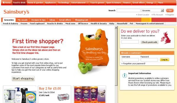
Hmmm – is it a fruit, vegetable or salad item? Or all three? The only way to find out is to click on the left-hand menu items:
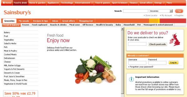
Nope, not in fruit. So, I’ll try another section:
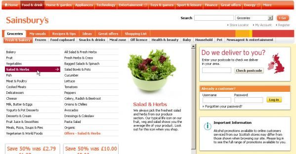
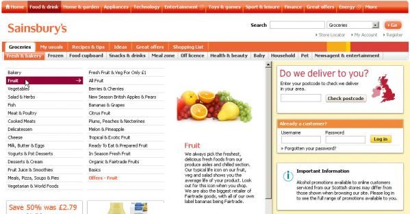
Found it. And now I can finally select “Tomatoes” – my fourth click from the grocery homepage. Total time: 42 seconds.
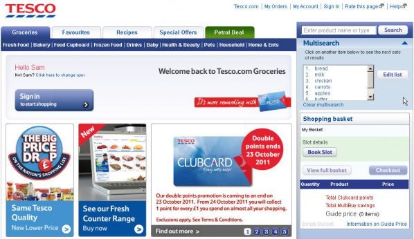
Exhibit B: Tesco.com
Hover over “Fresh food” and scan the list. Still the same dilemma – under what section is it listed? – but so much quicker and easier to scan the aisles and product sections within Tesco’s mega menu:
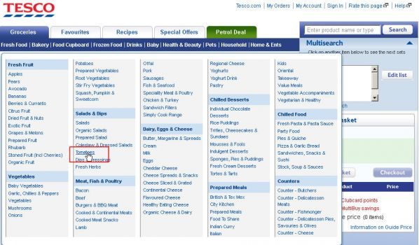
From the groceries homepage, I’m one click away from seeing all my tomato options. Total time: 8 seconds (and a nice, efficient feeling).
If you’ve lots of products or sections on your website, you should consider using a mega menu. To make the best of them, you should ensure they are:
Well styled
…with clear “sections” and lists of products within those sections. If a product could legitimately be in two sections – choose the most obvious one. Mega menus are so easy to scan that it’ll only take an extra second to find it – and it’ll save duplication. Duplication makes pages look more complicated than they are, and users will wonder what the difference is between “tomatoes” within the fruit section, and “tomatoes” within the salad section.
No scrolling
Make everything visible at once – that’s the point.
Activated upon hover
… rather than having to click.
The moral of the story – if you’ve lots of products, use a well-styled mega menu.
Your customers will thank you.
Something I’ve missed? Disagree? Leave a comment below…