As a self-confessed bake-oholic, I know exactly where the cookware section is in my local John Lewis. But as someone who hates shopping, I don’t register any of the departments that I travel through to get there. I just know that I look for the raised section with the sports stuff, and it’s to the left of that.
These physical cues that we rely on instinctively don’t exist online. So we need another way of knowing where we are, where we’ve been and where we can go.
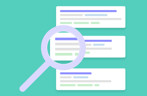
And that’s where navigation comes in. It’s the way people will find information within a website. And it’s essential for good usability.
Site-wide, consistent navigation
Imagine if, when you’re in the food section of M&S, the menswear is upstairs. But when you’re in the ladieswear section, it moves downstairs. Confused? Exactly. So don’t do the same to your users. Keep the same navigation in the same place throughout the site – to give visitors an anchor.
Clear “home” link
It’s standard practice that clicking on the company logo will take you to the home page. It’s the equivalent of being in Longleat maze, and knowing that you can raise your flag anytime, and someone will come and show you the way out – it gives you the confidence to explore.
Clear labelling
Use text rather than images. Text is much, much easier to scan quickly – images are not. Images can also be misinterpreted.
Users will usually arrive at your website with a clear goal in mind. And then they’ll scan the links for what they’re looking for. Make it easy for them by keeping link text short and descriptive, and matching it with the target page name. It will help customers feel comfortable – and then they’re more likely to explore.
Where am I?
Just as a clear link to the home page is important, users want to know where they are right now.
Keep page names clear and informative.
Indicate which area of the site they’re currently on – changing the colour is a good way.
If you’ve a particularly large site, breadcrumbs (from Hansel and Gretel) can also be used to show the key journey to the current page – and each interim step should be clickable so people can go back and forth.
Where have I been?
Change the colour of links that the user has visited. It’ll help them re-trace their steps.
Where can I go?
Present your visitor with a distinct list of follow-on pages, ordered by the most common, or logical.
Include a sitemap
A sitemap is a hierachical overview, or a list, of each page of your site. It gives a sense of the whole site, and allows customers to scan to find the page they’re after.
Following these basic principles will ensure that your site navigation doesn’t detract from your visitors’ goals – so they can concentrate on getting to the information they’re after quickly and easily.
Something I’ve missed? Don’t agree? Leave a comment below…