We all know that the homepage is one of the most important pages on a website, but how do you make it work for you? And what can you do to improve the one you’ve got?
Explain who you are and what you do – in 5 seconds
Yep, that’s how long you’ve got. Give or take a second or two. If visitors can’t get this business information from a glance at your homepage, you’ve lost ‘em. So…
a. Make your company name prominent…
b. … and your logo, with a strapline if you have one

c. Include a sentence or two that clearly and succinctly describes what you do, and why the visitor should choose you. This is especially important if your company name/logo doesn’t make it clear what you’re about.
d. Link to your “About us” page in the primary navigation (what’s this?) – and put all your company-related info there
Make it clear where they can go from here
Visitors should get a sense of what’s on your site – so they can quickly figure out whether it’s relevant and useful to them.
- Think about information architecture (what’s this?) – choose the top 1-3 things you’d like to promote and make them prominent… and above the fold (what’s this?). And make the other bits smaller – they’ll find them if they want to.
- Clear navigation – make it obvious the links are navigation, and include areas to key pages: About us/Company info, Contact us and a clear way back Home.
- Surface site content, especially real-time stuff that may be of interest, e.g. blogs, reviews, industry new. Whatever’s relevant to your customers.
Clean web design
Keep it simple. Busy pages overload the first-time visitor – so they’re less likely to hang around. It also makes it difficult to distinguish between useful content and adverts.
Load pages in less than 1 second
Download speeds are proportional to visitors’ patience – the faster they get, the less they’ve got. Don’t force animations or large files on your visitors – let them choose when to see them.
Graphic design
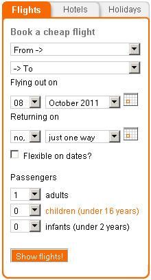
Engage your visitors with relevant graphics, good use of colour and minimum text. Encourage them to explore – include interactive bits where you can. Like Easyjet’s flight finder:
Site search
Offer search functionality. The larger, more complex your site, the more essential this is.
If you look at your home page through the eyes of your customers, you won’t go far wrong.
Don’t agree? Something I’ve missed? Leave a comment below…