How we’ve redesigned our website.
1. Your feedback
This was a user-centred design project. The feedback we got from users during the design process helped to shape this new site design. But the work doesn’t stop with the site going live, this is just the beginning. So, we’d love to hear your feedback about the new site, what you think can be improved, suggestions – tell us here in the comments, or contact us to send us your feedback.
2. Our user personas

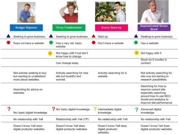
User Personas were one tool we used to redesign the site. We used these to check our design ideas against. They also communicated to the whole project team who we were designing for.
Do any of these sound familiar? We have designed this website for the following users:
- Owners and employees in small to medium sized businesses
- Marketing decision-makers in their companies
- People who have none to a lot of knowledge and experience about digital marketing
- Some who have a website, some who don’t
- Looking for a new first website, some need to replace an old one, some are just trying to find out what it all means
- Businesses who are seeking to grow, and some have just started-up
- Some are existing customers of Yell, some aren’t
- Most are unaware of the help Yell offers with online marketing, be it our free advice, free events to learn more about digital marketing, free tools and our digital products and services
3. SEO and user experience
Some people would say the two are always in conflict. This website is based around an SEO strategy, but comes with a lovely user experience. So, it’s about using common sense, balancing a perfect user experience within the site, with needing to get the site found by users on a search engine. We had to make sure people searching for ‘web design’ help would find our site, and all the valuable advice in it. It’s no good having all this lovely content if no one can find it! SEO is definitely not about cramming every page with repetitive keywords. Instead we have found that good SEO is based on what users are searching for and thinking about and by designing a site around what they’ve searched for on a search engine, we’re designing a site around what they’re thinking, which has actually really helped make it more user-centred. The main user journey we considered was a user searching from Google. The next was then what they’d want to do once they had found the site.
4. Content
We have created a carefully planned content editorial calendar based on our keyword topics Website design; Website content; Website build; Video marketing; Banner advertising; Pay-per-click; Search engine optimisation and Social media. We have Site Editors who have coordinated an internal and external team of topic-expert writers who are now writing for us every week. We will use Web Analytics to measure how content is used and will publish more content to reflect what people actually read.
5. Website build
We’ve used WordPress to build this website. This is a Blogging platform which we’ve used as a content management system. It enables our 100+ writers to write new articles every week, and it enables us to manage the site so we can add pages and different sections quickly and easily.
Tell us what you think
We’d love to hear your feedback – let us know in the comments below.


