They say it’s what’s on the inside that counts and, just like (most) people, websites have personalities too. Where some people are fun and vibrant so are websites! Along with content strategy and tone of voice, visual design significantly contributes to the personality of your website. So how should you go about injecting the right personality into your website design?
Firstly you should consider your brand and what personality attributes are appropriate to your business and target market. If you’re an accountancy your branding is going to be completely different from that of a children’s clothes retailer. An accountancy will likely want their branding to convey professionalism, reliability and honesty to their business clients. Whereas a children’s clothes retailer will likely convey fun, value for money and style. As part of your companies branding and marketing efforts it’s likely you’ve already considered your corporate personality.
After you’ve established the desired personality of your website then a designer must incorporate those attributes into the design. This is easier than it sounds. There are certain colours and styles that people associate with different attributes. For example, a dentist practice would want to convey a hygienic operation, people associate the colour white with cleanliness so this would be a good colour to use on a dentists website.
Let’s take a look at how some websites currently integrate their personality traits into website designs.

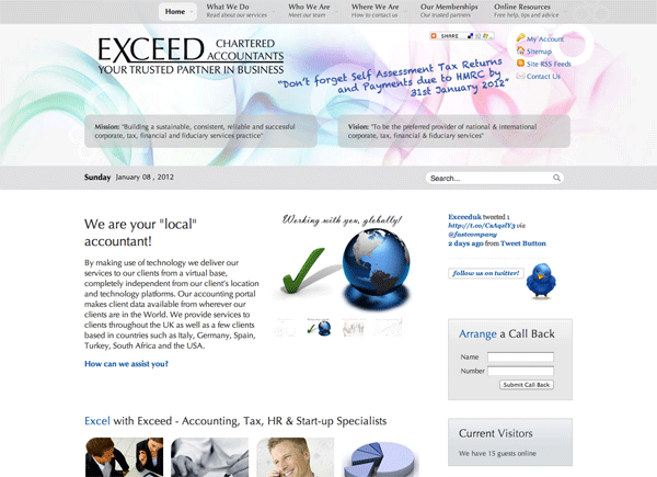
Exceed UK are an accountancy firm. Their website features a lot of corporate imagery with men in suits, graphs etc. which shows that this is a professional business. The sleek and clutter-free design with white and grey colours are again very corporate appealing to their business customers.

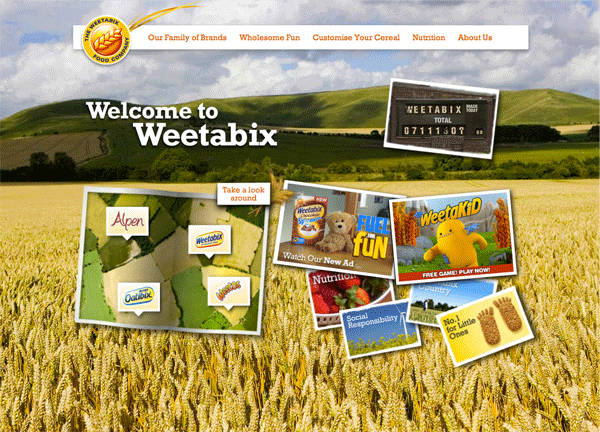
Weetabix, a well known breakfast cereal, promotes itself as a healthy wholesome breakfast meal. The Weetabix website has a couple of elements which project it’s healthy brand attitude. Firstly, the website uses natural imagery, such as the farmers field, creating the idea that the food is made with natural ingredients. Secondly, the website uses colours we associate with nature such as browns, oranges, greens and off-whites. It’s surprising the atmosphere and personality that can be created with a few considered design elements.
Before jumping into your next website design, carefully consider what personality you want your website to convey.


