This month’s learning’s are coming to us from Cornwall in the shape of clothing retailer Seasalt.
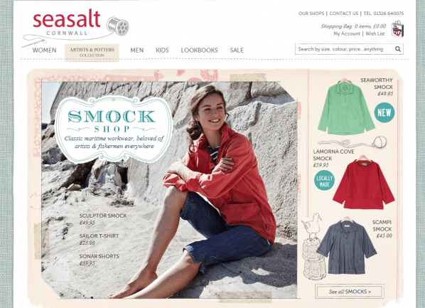
Why do we love Seasalt? Well just look at how they show their content! The products have simple pictures that are complimented by illustrations which add not detract from them.


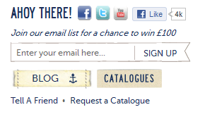
They’re also using their online channels really well. On the homepage you can follow their Facebook & Twitter or you can sign up to their email newsletter, or read their blog, or get a catalogue or…the list goes on. This is how to get your website content known about, outside of your website – really well done.
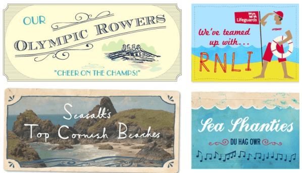
These guys are all about quality and locally produced clothing which is why their ‘Our Cornwall’ section is noteworthy. I can’t show all of the content or this blog will stretch for a while but this snippet shows their creativity. They have their own singing group who they talk about and show videos of them performing at local events. Additionally they’ve got their team to list out their favourite Cornish beaches, complete with pictures and reviews. As a nod to the Olympics this year they’ve got a page on our rowers from their neck of the woods, asking people to show support for our Olympic hopefuls. If all that doesn’t get their brand engrained in people’s minds who like local produce then I don’t know what will!

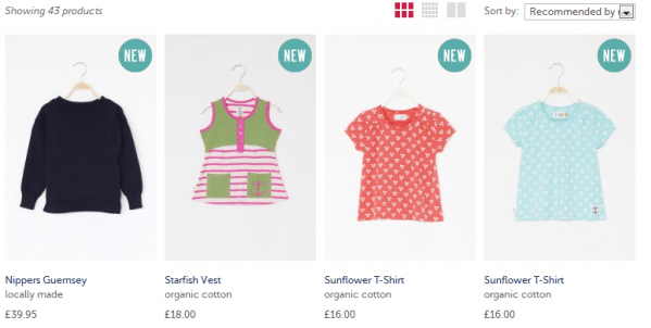
Lastly I like how they lay out their products on sale. You get simple images that when you hover over show them being worn and you can choose whether you’d like large images, small images or a list. Reminds me of windows folders which I’m already familiar with. If a product is new then you get a round sticker on the image showing it is, the same if in the sale. I like the non fuss approach to showing off the content – it leaves the clothing to sell itself.

And that’s what sums up the whole site to me, the website content is lovely enough to engage you but then leaves you alone to enjoy a good shopping experience.


