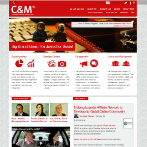
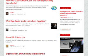
This week I’m looking at the website for Content & Motion and these guys should be good as they’re an online communications agency!
My first thing to say is that I LOVE the imagery of Lego people that runs throughout the site, it really ties it together and gives you the quirky, human feel that a social agency should have.
These guys know SEO so their homepage is full of juicy content and titles that include their main keywords.

Also noteworthy is that they have included video content on their homepage and also further down they have a selection of their Flickr album. Now I’m not saying we should all go out and add this to our websites, it will vary depending on your audience but I’ve seen that people are drawn to newer media so this is a great way of adding that human element to your site. In addition it will also help your natural search rankings as video and images are now included in Google results plus your social presence is taken into account.
Bug bears? I can’t click on the four main blocks of copy content to get further detail which is frustrating and their phone number is right at the bottom which I have to scroll to. I don’t mind a good scroll but contact details should be first and foremost visible throughout the homepage.
With such a simple navigation I’m not expecting to have to wade through reams of content on this site to get the information I need. Be aware of that with your site – if you have a large site with a lot of content then make it obvious from the outset that it’s there – a simple sub nav overlay as you hover over the main navigation is plenty. If not then you’d better make sure your site search is prominent and also good!

Every page of their site is immersed with multimedia content option which is great. This is not a static or dull experience – I’m not bogged down in plain text but the associated images and videos are all relevant. If you do want to spice up your site content then make sure what you’re using is relevant.


