Today I got an email from Next and as an email marketer I did my usual scanning to see what was good about it and how it could be improved. Then I thought that I should these learnings with you, as they’re simple things that you can do right now.
1. Put alternative text behind images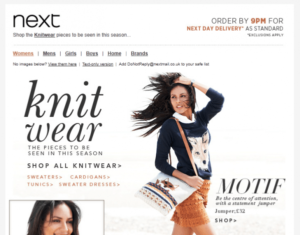
This is really easy for your designer to do and can have a big impact on your open rates (which is the first step to click throughs and those web conversions). Don’t just expect that people are going to switch on their images (which are usually off as standard) and delight in your huge images. They need to have a good impression without them so be descriptive and tell people why they should switch those images on.
2. Beware huge images
I mention this in my last point and it’s amazing how many large brands use them – but they can ruin your emails! With images switched off all your recipient sees is a large empty box filling their screen. In hotmail you can’t even see alt text – they give you a special view of a large grey box – not really inspiring action. Finally if your ‘text to image’ ratio is off (ie you have more images than text) then your ability to get into the inbox may be hampered as ISPs see that as a spammy action.
3. Think mobile
I like the way that Next have thought about what their email will look like in the inbox, and by that I mean the mobile inbox. iPhones especially will take the first copy they find in an email and display it as a description so if you have ‘view online’ or ‘you’re reading this because you subscribed’ it’s not as interesting as ‘shop the knitwear pieces to be seen in this Winter’. So they’ve moved their not so interesting but necessary copy below their top banner where it will still be auctioned but only once the key message has been.
4. Give a reason to be social
Next do have their social icons at the bottom of their email but firstly they are greyed out so not really drawing the eye and secondly they don’t give a compelling reason for any action. ‘View the must have winter catwalks’ would compel me to visit their Youtube or ‘Be the first to hear our fashion news’ may get me following a Twitter account – ‘stay social’ is not that far removed from ‘follow us’ or ‘stay in touch’.