Website accessibility is massively overlooked by everyone and it should be one of your highest priorities. Here’s why…
Website accessibility allows people with disabilities to use your website. People that have visual disabilities, restricted movement, seizure disorders or learning difficulties should all be able to access your website and it’s your responsibility to ensure that they can, in fact, you are breaking the law if you don’t!
Many disabled users use special tools and software which allows them to access websites. For example, visually impaired people use screen readers which reads the web pages out loud to them. This means that the websites should be built and designed to work with these tools.
Ok great, so now your telling us we need to spend more time and money on something that only a few number of people will benefit from?
Actually no. Improving accessibility improves the web experience for all users. Greater accessibility means the website is more accessible for SEO robots who put your website in the search engines like Google. The business benefits are certainly there too. By increasing the number of users who can access your website the more business leads you are likely to generate.
So how do we design a website that lets all these different people access our website?
A lot of a website’s accessibility issues can be improved by using good markup. Markup is the HTML that a makes a website visible and interactive in a web browser. Unless you yourself are a website designer you needn’t be concerned with the specifics but the person preparing the code needs to be coding with accessibility in mind. Some of the things they’ll be looking at are:
- Providing alternative text for when users can’t view the images;
- Having descriptive website links;
- Clearly defining website section headings.
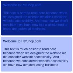
 There are also some considerations to make when the website is being designed visually. Accessibility should be at the forefront of your mind when making design decisions. Take this example (see right): a potential customer is visually impaired and struggles to differentiate between different shades of blue. Your website is mainly blue text on a darker blue background, usually impaired users find it difficult to read the text and so require a high contrast between the text colour and the background colour.
The WAI (web accessibility iniative) have produced the web content accessibility guidelines (WCAG) which is a great place to start in understanding what you need to do to develop accessible websites.
Website accessibility needn’t be a pain point in the web design process. A web designer worth their dollar should already be considering these issues on behalf of your business. But don’t leave it to chance: web accessibility is fundamental in the development of the web for everyone and without accessibility leaders businesses would be alienating their customers.


