For those who haven’t heard of an infographic before – they are basically a visual way of showing information and data. They’ve become more and more popular as website content in the past year as people like to read a good stat, they like to learn something new and they love to have it presented in an interesting and creative way!
Infographics are also popular for social media marketing as they are highly shareable and some companies will even provide the html code so people can put them on their own website.
I thought I’d run you through some examples of good infographics so you can gather some inspiration if you’re thinking of doing your own. Also if you want to show them on your own site/blog then you can but make sure you acknowledge who originally created them as it’s best practice.
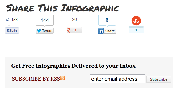
First up is a website called Daily Infographic – these guys (who knew!) post one every single day on a huge variety of topics.
What they do well is before they show each infographic they have a clear title, sharing options and a few paras of intro text.

Afterward they have the sharing options again and also a subscription box for their email updates – a great place to capture this information.
If you are going to have this many infographics on your site then make sure there is a simple way for visitors to search them, tag them with relevant topics and keywords.
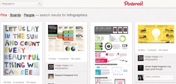
Another place where you can find (or post) inforgraphics is Pinterest. If you’ve not heard of this social site before – it is new this year, you have to apply to use it but it’s fairly addictive once you do. On Pinterest people create mood boards of images that they’ve either taken pictures of or seen online and they can share them with others. You can upload images straight from your phone with their app and it’s good for sharing.

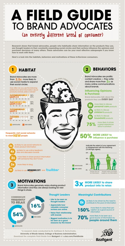
Finally I’ll show you an infographic in full – see the one below from BzzAgent. This is visually very nice, it has lots of clear stats and the imagery relates to the topic. At the bottom of the infographics they have shown the source of the data – this is really important if you want credibility or you’ll just get lots of people asking whether you made your stats up!

If you’re creating your own infographic then I would suggest putting your logo within the design and not just at the bottom as some people will trim it off and use as their own. In the same context, please remember to always give credit to anywhere you get data from and if it’s not your design – whose it is.
And infographics can be as long or as short or as wide as you want them to be so play about with length and whether landscape or portrait.


