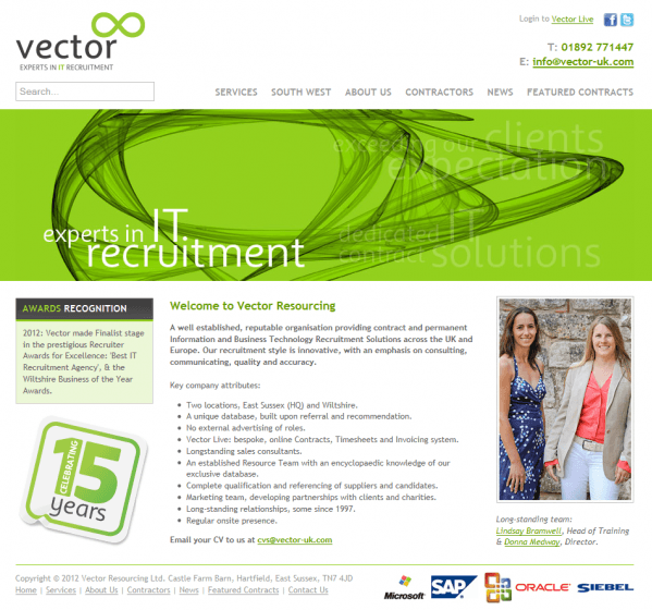
This week I’m looking at a recruitment website in the form of Vector Resourcing. These guys specialise in IT recruitment and contracting and have been going for about 15 years.
Their website content is very much aimed at their niche market with both design and tone of content less consumer and more professional services. What I like about their site is the fact that they keep adding the personal touch to their site – their business is about people so they focus on that with imagery of the team and quotes from contractors and businesses.

Their homepage content is very clean and uncluttered. It shows people straight away which will engage their visitors. It also has this great 15 years badge that you can click through to see a news story about how old they are and their history. This kind of content cements that they are experts and instils a sense of trust in the company. I can instantly see recognisable logos of brands they work with (I assume they work with because they don’t actually tell me so).
An area they could improve in, which is common on websites, is to try and get people to engage with their social networks. Just having a logo is not enough – there should be a call to action and reason for people to engage – ‘talk with the team’or ‘join our Facebook community’.

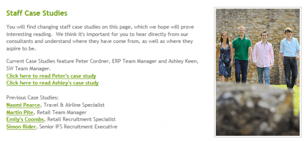
Following on from their ‘people’ theme is a nice page on staff case studies. Instead of trying to get case studies from clients and contractors (which in my last article I’d mentioned was hard to do), they’ve created their own ones with internal staff. It still gives a good impression of the company as they talk about working there and what attracted them to the role and also still covers the topic of recruitment so a good idea.

If you go to their contractors page through the top navigation you can see a whole section giving advice on how to be a successful contractor. I like that they have put a call to action at the top of their sidebar, it sets the expectation before they’ve even read the advice. The titles aren’t exactly snappy but the industry they’re working in would probably forgive that as they are about facts not fluff.
I like the variety of the content they make available in this section, they’re obviously thought about what their target audience really needs and are making their contact invaluable and relevant.
All in all it’s a good site that gives plenty of useful website content that will be appreciated by their visitors. The visitor path and call to actions could be improved but there is a search panel you can use and there’s not so much content that you’d never find what you’re looking for. This site is a great example of working for your audience and not focussing on the whizz bang but the necessary.


