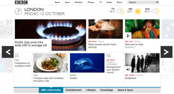
I don’t normally focus on such an iconic website as The BBC when doing these website content reviews, but these guys are doing something new that I find quite interesting. They’re truly making their website tablet and mobile friendly. And I’m not talking slightly larger buttons but a total shift away from how a conventional website works.

Take the top of their homepage to start with – you have large blocks of highly visual imagery that simply show you titles and categories. Yes they are large, as are the icons and links but that’s not only what makes them tablet friendly. I like how the images show on a handset screen, they really show off the investment in my mobile purchase – screens are highly advanced now. You can also swipe easily to the side to view more content, not up and down like traditional site navigation.
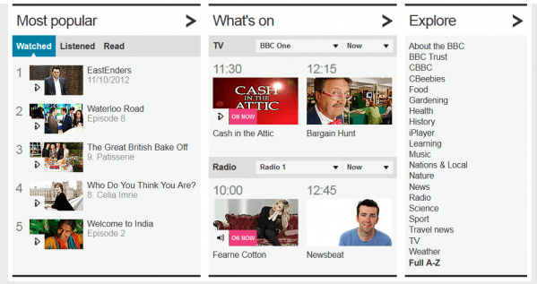
The content they show is ideal for playing on your handset with videos in abundance and I can listen to the radio which is quite appealing when I’m on the move. Everything is fairly bitesized which makes for easier consumption and on the bottom half of the homepage, I get three simple columns with easy lists to look through.

My favourite is the Most Popular list, not just for the fact that it’s showing me what other people have already approved but mainly because the way it lists them. I can view by watched so if I fancy looking at some videos they’re all in one place, or perhaps I prefer to digest my information through the headphones so I get listened. Others prefer to just read words so you get the Read option as well. It caters for every type of consumption preference there can be on a site – all you need is scratch and sniff to complete the set!
You may prefer the traditional site they used to have, I’m still in two minds when I’m on a PC but then I’m more likely to be catching up with news on the go.
The BBC released their new site in a phased way to get people used to the new format – it also gave them a chance to test what was working and not so they could make any changes before the final site went live. It’s a good way to see whether your content will sink or swim – tell people what you’re planning to do and then let them choose their favourite instead of you guessing.


