Summary
This article gives 10 examples of how SEO and user experience work together in the planning phases for a new website. The planning, design and build of this website (marketing.yell.com) is a great case study of how search engine optimisation (SEO) and user experience (UX) can work together. The result of SEO and UX working together are a website where users easily find relevant information they are searching for from a search engine.
1. Strategy and site proposition
Right from the beginning, the SEO/ SEM and UX team members worked very closely together.
- SEO – To get traffic to the site the project team identified an SEO strategy which was going to be very important.
- UX – Users who found the site would need to find it to be useful and easy to use, with a good user experience.
- SEOUX – We created a single site strategy and proposition with joined-up SEO and UX objectives.
2. User needs and goals
- UX – User’s needs and goals were profiled into user personas, which are a UX tool. These user personas were shared and debated with the whole team.
- SEO – The SEO experts added their own details to the personas, like what keywords users would be searching for.
- SEOUX – Personas which the whole digital team, including the SEO and UX team members, would find useful for the rest of the project to focus them on the users.
3. Keyword research

- SEO – The SEO experts in the team used the site strategy, user personas, goals and needs to identify the key words users would use most in search engines.
- UX – This keyword research was an important input for the UX experts to design the information architecture and for the Content Managers to create content for the site.
- SEOUX – A content strategy and Information Architecture for the site which are optimised for the keywords users will use to find the site.
4. Choice of domain name
![]()
- UX – wanted a domain name which made most sense to the users being targeted, would help the site to be found, and formed an anchor point for users checking they’d found the right place. The domain name needed to be relevant to users.
- SEO – also wanted a domain which would help the site to be found and made sense to targeted users, but also had the knowledge to know which domain would work best for us in the fastest amount of time.
- SEOUX – The one we chose was one that already had some momentum with traffic on Google, and users looking for marketing advice would find relevant.
5. Upside down site structure
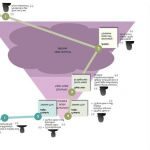
- SEO – Want to get users to find information they have searched for as efficiently as possible.
- UX – Want to get users to find information they have searched for as efficiently as possible.
This sounds simple, but required the UX experts to think differently.
Which do you think is more important, the Homepage of a website or an article page?
It depends what most of your users will see first. If you think of your website as an island, then the Homepage is the starting point for users. But if you think about a website as part of a bigger user experience, and consider the user journey from a search on a search engine, it turns the hierarchy of a website upside down. A user searching for advice on a search engine will want to find that advice and go straight to it in as few clicks as possible – so go straight to the information which answers their questions – which is unlikely to be on a homepage.
So, the UX experts in this site’s team didn’t start with the homepage for the start of the user journey. Instead the start of the user journey was mapped from a search on a search engine to the article pages, and then how users would explore between articles and different areas of the site, perhaps without ever visiting the homepage.
- SEOUX – a site structure which gets users to find information they have searched for on a search engine as efficiently as possible, and then provides multiple ways for the user to discover other related, relevant information.
6. Information Architecture

- SEO – pages, headings, page titles, links – all need to be optimised with keywords.
- UX – Most user journeys in this website will start from search engines, so a deeper level of navigation, like relevant links, were created to help users find relevant navigation within a page, and not have to rely to going back up to the top-level navigation.
- SEOUX – The biggest debate we had for this site was around the top level navigation of the website. If you divorce the site’s user experience from search, having Web Design at the very top could be confusing for users. But for SEO having Web Design in the top level navigation was crucial. However if you are targeting users who are searching ‘web design’ in a search engine, and they see this very clearly when they come to the site, it makes complete sense – in other words when the user experience considers the full user journey from the beginning, not just the site in isolation. What do you think? Let us know in the ‘comments’ below…
7. Site optimisation in design phase
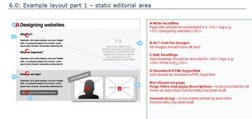
- UX – produced the wireframes for the main pages on the site.
- SEO – annotated the wireframes for SEO optimisation to ensure the site was optimised as it was built. Recommendations included page titles, headings, tagging, categorisation of the site.
- SEOUX – we knew what we needed to do for both SEO and UX before we built the site with annotated wireframes.
8. Website build
- UX – business users wanted control over the build of the user interface of the site so that we could work in an agile, iterative way with designers to refine it as it was developed. This was so we could achieve the best possible UX in the time we had, with as little cost as possible.
- SEO – wanted to be able to optimise the site pages and content for SEO as it was built, and to keep control of this so that as the site evolved they could refine their work.
- SEOUX – In the website build stage we used WordPress with Carrington modules. WordPress is very easy to use, you don’t have to be technical. Our brilliant developers made Carrington modules which reflected our wireframes and page designs to make this possible. Once they had given us our ‘toolbox’ the actual build and content population of the site you can see was done by a few people in marketing who have no idea about website code. This also means that when we change the content on the site, we can do it straight away without it costing the business anything. This was really easy for non-technical people to do. The User Experience and usability of WordPress are exceptionally good. It is very efficient, effective at enabling you to complete tasks, easy to learn and to remember how to use – which makes the whole process faster.
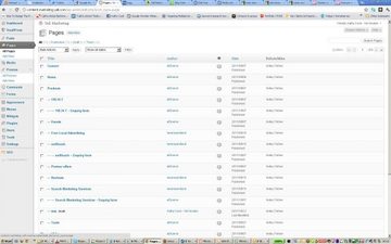
Page structure created in WordPress which followed the site structure:
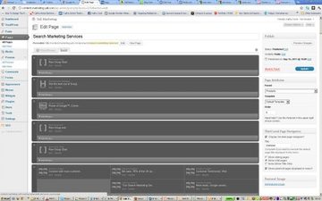
Page layouts created using Carrington modules which followed the wireframes:
9. SEO Site optimisation in build phase.
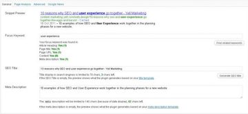
- SEO – experts used WordPress to optimise every page, including the page urls, images, links, tagging, categorisation. Again, WordPress makes this very easy to do. WordPress has amazing functionality for SEO, and we installed some of our own additional choices of Plugins to make this very powerful. They also made recommendations for the copy used on-page to ensure on-page optimisation.
- UX – The SEO team made sure that nothing in their work compromised the user experience, so for example they did not do ‘keyword stuffing’ putting keywords where they don’t help users.
- SEOUX – the site is built and optimised in a way which will help users to find and use the site.
10. Measurement
- UX – We use Usability Testing, users’ feedback via Comments, and web analytics tools (Google Analytics and others) to validate the logic of the wording on screen for users, the pagination and site structure. Usability testing is very important to do this – focus groups won’t work. User feedback is vitally important to us. Use the comments on this site to tell us what you think and how we can improve.
- SEO – The team are constantly monitoring the use of content and traffic from search to find out what is working to help users find relevant content.
- SEOUX – SEO and Usage are measured and reported together. What is relevant and useful to users (and is not) is as important for SEO measurement as it is for UX.
The site will continue to evolve and SEO and UX will continue to work together, for users, and for our business.
76NG6VCJ5HXA


