 Any small business is likely to tackle web copy at some point, and translating the words from a Post-it to a living, breathing web page can be a messy process.
As the point of a business website is to get people to call/sign up/buy, every bit of content has to be in a tidy and easy-to-use design.
Getting that content signed off is another a nightmare, so anything you can do to make your copy easy for people understand, visualise and work on will help.
So here’s how.
1. Content structure
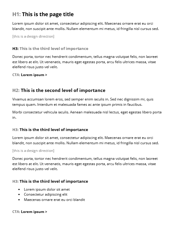
Page structure or, particularly for the web, content architecture, tells people what’s important. Headings (H1, H2, H3 etc.) are important because they let a reader scan for what they’re into. Calls to action (CTAs) are important because they’re the next step you want someone to take.
Writing into a clear structure is so critical for web design because you’re basically signalling to the designer how it should be built. Content structure that’s then coded correctly will be search engine-friendly because it’s easy for a web crawler to check for readability.
How to mark up your content structure

Every type of web page requires a slightly different structure but you’ll need to visualise what it is before you start writing.
Otherwise, you just have a big Word document with no subheadings – and the designer that gets their hands on it will literally put that on a page.
The structure of a web page leads people gently through a process. It helps draw the eye in the right way…and it just looks better.
The web page title will always be the biggest on the page (the H1 – Heading 1). The main sections of the content will have titles the same size, with multiple sub-sections underneath. Any sections of equal importance should have matching heading sizes.
If your structure isn’t good, people will get lost. Look at different kinds of content and dissect how it’s structured – it’s way easier to start writing if you know how your content should be organised.
Links
The person writing the content is the most likely to know which topics are related. That makes YOU the person who needs to work out where your copy should link.
In your document that will go to a designer – or, like, Kathy in IT who’s a bit of a whizz with the old web – you’ll need to highlight the copy that will be clickable, then add a comment to put your URL in.
How to mark up your links
I get about three ‘first stabs’ or ‘brain dumps’ a day that have links just pasted right into the copy. Do you want broken links on web pages? That’s how you get broken links on web pages.

Design elements
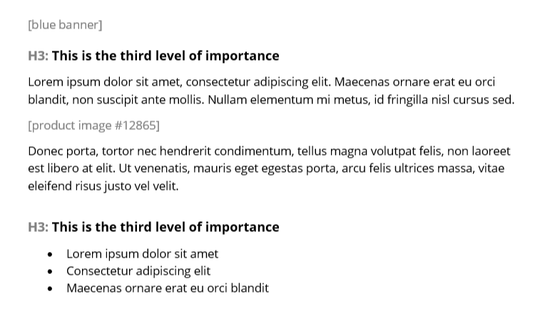
You’re not in charge of briefing a designer but you do know what will complement what you’ve written. Most designers will be chuffed to get some direction in draft copy so they know where to start. If you have an exact brand asset in mind that you know already exists, you’ll also save the designer time by letting them know to use that.

Make your design directions distinct from the copy so no one’s confused and they don’t end up pasted onto your web page. If you already have a very set format for your web pages, try to match your design directions to that. It’s quicker, easier and will keep your web pages consistent – very important for a customer’s online journey.
This is how you make copy and design work together
How you prepare copy for design is going to be a big part of how successful a web page is, for visual impact, customer usability and search engine-friendliness. And it doesn’t take any technical knowledge beyond what the names of basic web page elements (calls to action, H1s, URLs and so on), which your designer can help you with.
For the minutes it takes to mark up your content, it could save hours in build and signoff time.


