In addition to writing about website user experience, I will feature some examples of the best of UK small business websites here each month, to illustrate how the tips I’ve been giving about UX can come together for small businesses and with brilliant results.
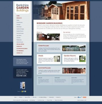
Berkshire Garden Buildings are a small business who sell garden sheds, or buildings. They have a website with a good user experience.

They have a site which is easy to use, efficient, useful, simple, and has functionality with good utility. In other words it has good usability. Users will quickly and easily be able to evaluate who they are, what they do, what they offer, where to find them and how to contact them. They have clearly thought about the user when they have built this site, and how the user’s main goal would be to evaluate what they offer, so their website forms a very effective product catalogue.
The good user experience of the site comes together from a combination of different elements of the user experience working well:
- A clear homepage which means users will immediately know what this business is about and what they offer.
- Clear, persistent navigation, so users won’t get lost using this site.
- Simple – they have not over-cluttered the site, but have focused on the most important information, which will make it easier and more efficient to use.
- Good utility – the right information and functionality is presented at the right time.
- Safe – there won’t be any surprises for users, and users can always get back to the homepage.
- Shallow site structure, everything is within a few clicks of the homepage.
- Clear contact details at the top of the page, plus an online contact form.
- Easy to scan copy and content for quick reading online.
- Balanced and useful imagery, including product galleries, to communicate different product ranges and items.
- Online video which users can watch to find out more.
- Links to social media channels such as their Facebook page.
- Clickable objects and areas are very clear, making it feel easy to use.
- Compelling content, including testimonials from happy customers.
“This website has given us so much more than we expected. We’d dabbled in the past with websites, but they felt very ‘template’ and ‘samey’ but now we’ve got exactly what we want and we’re very, very imprssed with teh outcome. It’s made us feel that we’re moving forward as a business and we’re proud to have it as our website.” Richard Taylor, Berkshire Garden Buildings.
How could the user experience be improved?
Show the people behind the business to make it feel more personal, such as who are the names and faces behind Berkshire Garden Buildings.


