 It’s no secret that I love Canva. I use it nearly every day for work and freelance and general life.
Although it’s a fabulous platform for creating free designs, it’s always had a few flaws. Not bad enough to make me go elsewhere but a bit annoying.
But guess what? It looks like Canva’s mopping those flaws up, one by one.
1. Paid-for photos and illustrations
Canva had a very limited range of free photos and a bigger but not quite big enough collection of illustrations. You also couldn’t search for the free ones: you had to scroll forever, falling in love with paid-for ones along the way. Which was obviously the point.
Now, though – there they are!
Brilliant little illustrations and a whole section for free photos.
You’re not going to find the 2016 model of a particular tractor you sell, but you will find lots of lovely scenery and ‘feelings’ images.
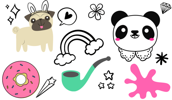
(Struggling to see what else you could possibly need)
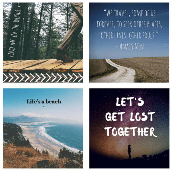
Two-minute Instagram graphics I’ve made with Canva
2. A lack of file organisation
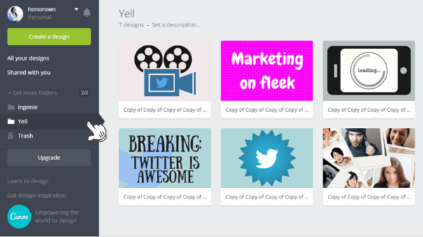
No more! Now, the free account lets you store your files in folders – much easier than the endless wall of graphics I’d been building for years.
If two people are sharing the same Canva account (so they have access to the right bank of your assets), this is a thing of beauty. You can also rescue things you’ve deleted from the Trash folder.
3. Fiddly floating toolbar
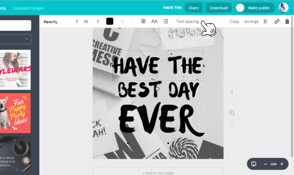
The toolbar that adapts depending on where you click (text, image or icon) is now stuck to the top of your screen and everything’s visible, with nothing hidden in sub-menus. It makes everything a lot quicker – and hey, that’s what Canva’s for.
4. No saved colour palette
If you’re working on a graphic over a few days or someone else is going to be making edits, it used to be very hard to keep track of which exact colours you’d been using. Each time you used a new colour, your previously used tones would be replaced.
Now, you can create a document palette, which allows you to select colours to save. Everything stays consistent, you don’t need to remember the codes for the colours and it’s easy for another person to pick up where you left off.

5. Limited layout templates
If you’re using Canva because you’re not a trained designer (yup, that’s me) and you can’t pay one to make nice graphics for you (also me), you need things to be as easy as possible.
Canva’s templates, especially for sexy social graphics, have always been good. However, if you’re Instagramming all the time, you could run through those very quickly.
On top of the original templates, there are now LOADS more and they’re all beautiful. Although most feature those paid-for photos to lure you into spending actual money (gasp!), it’s super easy to replace those with free images or your own photos.
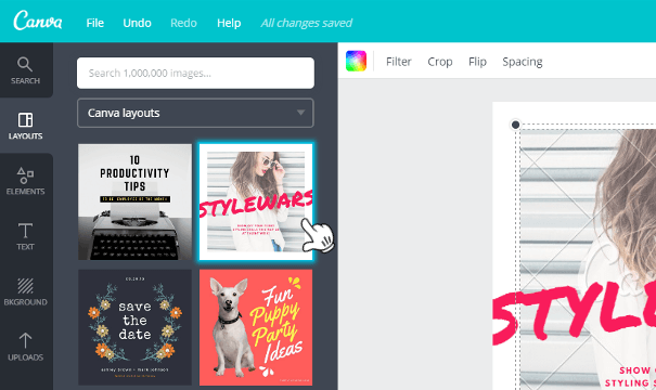
Just keep an eye out for anything with the Canva watermark on it – if you fall in love with one of those, you’ll have to pay the $1 charge for using it.
Plus: easy infographics
I’ve also recently discovered another platform that looks a LOT like it was developed by the same people: Piktochart. It must be quite new because the only thing locked down so far is templates – graphics, backgrounds and images are still free.
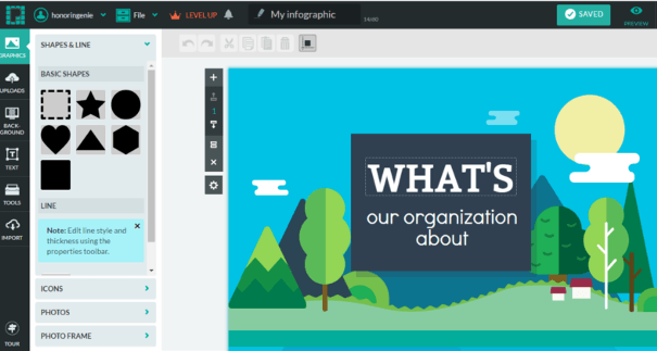
There are some really nice illustrations and it’s pretty easy to make your design look good even without the one free template they give you.
[bctt tweet=”You’re running out of excuses for NOT making your own social graphics.” username=”yellbusiness”]


