
Your design is unique to you – don’t take that from others. But often the key to a successful website is how it’s laid out; how the placement of elements encourages engagement and onward journeying.
Big companies spend ohmygoshsomuch on the psychological theory behind web design, which is probably not going to feature greatly in the average small business budget for 2015. So, here’s an awesome secret…
Wirify lets you make any website into a wireframe
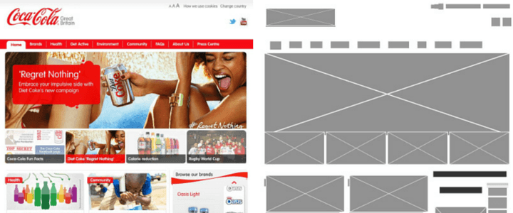
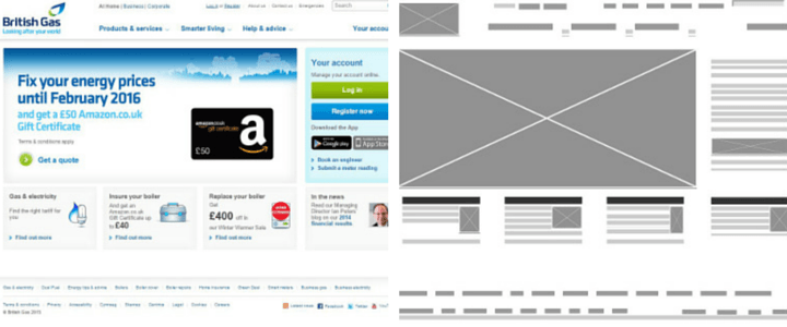
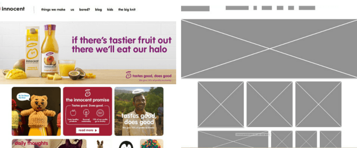
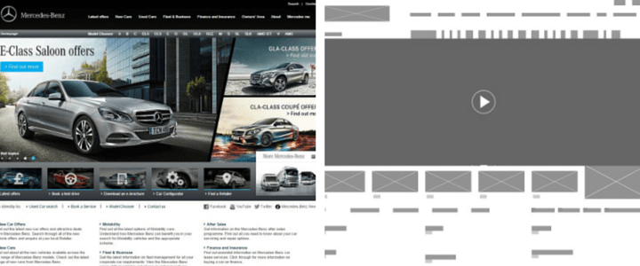
A wireframe is a blocked-out plan for a web page. It tells you where images live, how the navigation works…it’s a sketch of your site.
Wirify is a browser extension that magically turns any website into a wireframe. Some come out better than others (it’s not so good for blogs or other sites with continually loading vertical feeds) but it could give you some big clues on how to lay out your website to maximum effect.
Coca-Cola
British Gas
Innocent
Mercedes
Wickes
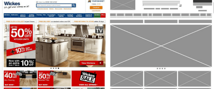
Neat, huh?
It’s amazing how basic websites often are underneath the great styling. When it comes to layout, it’s clearly a good idea to keep things simple and tidy, and use beautiful graphics or even full-width videos to achieve your wow factor.
Blog structure can be just as simple – check out my cheat sheet for laying out blog posts.
[bctt tweet=”Underneath the fancy stuff, a website often has a super simple layout. And that’s easy to learn from…”]


