On 26 February 2015, Google announced via its Webmaster Central Blog that from 21 April, it would be expanding on mobile-friendliness as a ranking signal (an algorithmic change that was soon to be called ‘Mobilegeddon’). We’ve previously covered what this means for website owners, and how you can test your site for mobile friendliness, here.
Along with Google’s statement that the update would ‘have a significant impact in our search results’, even its unofficial name seemed designed to create panic. Would this be the biggest shake-up in organic search since the first Penguin update in 2012? Or indeed ever? Would businesses without mobile-friendly sites lose up to half of their traffic overnight?
What actually happened?
Now that the dust has been allowed to settle a little, we can see more clearly what the impact has been to date. Analysis by BrightEdge a week after the roll-out found that non-mobile-friendly sites decreased visibility on the first page of results by around 17%. Analysis by Moz found that the percentage of sites on the first SERP classed as mobile-friendly crept up from around 66% a fortnight before Mobilegeddon, to around 72% a week after.
Admittedly while some sites did emerge as early losers (including Reddit, Vogue and Bloomberg Business), the general consensus is that the impact has been less than anticipated. There are a number of reasons why this may be the case:
- If, as Moz’s data suggests, around 70% of pages on the first SERP were already mobile-friendly, only a third of sites were vulnerable to a drop.
- The roll-out of the algorithm could be more gradual than many envisaged.
- Mobile-friendliness remains a single ranking signal (out of approximately 200). As Google has stated, search intent will always be the key factor for rank (ie Google wants you to find what’s most useful for you, given your query). So great content can still outrank inferior mobile-friendly content.
Mobilegeddon: facts vs. myth
Prior to the deployment of the algorithm, rumours surfaced as to how Mobilegeddon would impact search – and not all of those rumours were based on fact. Example rumours included:
“Mobilegeddon will also affect rankings on desktop or tablet.”
Not true.
“Mobilegeddon will make it difficult for people to find your brand.”
The easiest way to think about this is that Google always wants users to find the most relevant content for their search query. So if they’ve searched for your company name, that’s what they expect to find, and that’s what Google will show – regardless of your mobile-friendliness. The only exception might be if your company name is also a generic word; conceivably you could lose rank for what’s considered a general search term.
“If your site isn’t mobile-friendly, you could get removed from the index.”
Not true. Google is working on separate desktop and mobile indexes. If your site isn’t mobile-friendly, you run the risk of losing rank for searches conducted on mobile. Your pages certainly won’t be removed altogether because they don’t meet Google’s mobile requirements.
“Responsive is the only option; a mobile site isn’t sufficient any more.”
Wrong. Responsive design is what Google would prefer you to do, for reasons including ease of maintenance, using a single URL set, and that mobile sites require separate indexing and often have reduced content compared to the original. But a mobile subdomain, if built correctly, is entirely sufficient to pass Google’s mobile-friendly test.
How can you tell if Mobilegeddon has affected your search traffic?
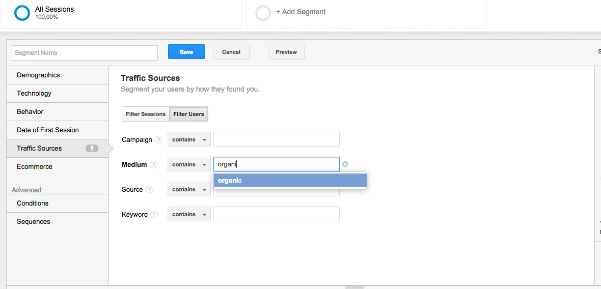
The best way to do this, assuming you don’t have SEO tools that can measure rank for mobile traffic, is to create a custom view in Google Analytics. In your Overview, go to ‘Add Segment’, then click ‘New Segment’. Go to ‘Traffic Sources’, and then by Medium, type ‘organic’:

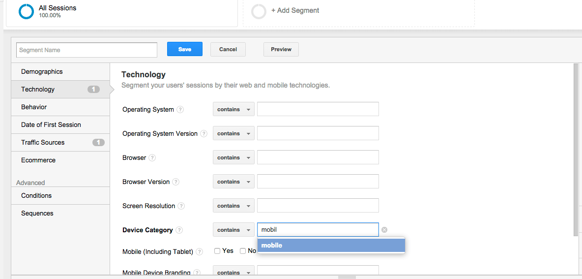
Then go to ‘Technology’, and by Device Category, type ‘mobile’:

Save that view as ‘Mobile organic traffic’ or similar. You can then compare the period from April 21 to the previous period, and analyse overall performance, or particular landing pages (via Behaviour > Site Content > Landing Pages).
Check in particular for pages that have seen a decline in users, and then assess them for mobile-friendliness using the Google testing tool mentioned previously. Look closely at any pages that you know either bring in a high percentage of traffic, or lead to conversions. These are the engines of your website, and any impact here for mobile could make a big difference.
Sensible next steps in a post-Mobilegeddon world
Just because the impact of Mobilegeddon to date has been smaller than many feared, doesn’t mean you should sit on your laurels or think this wasn’t a significant update. Google is very serious about mobile user experience, and if your site is the pinch-and-zoom type where it’s very difficult to make a purchase, browse a catalogue or fill in a form on mobile, you will eventually face trouble.
Stay ahead of the game by doing the following:
- Audit your site using Google Analytics (as above), as well as running your key pages through Google’s mobile-friendliness tool. Also regularly check the Mobile Usability section under ‘Search Traffic’ in Google Webmaster Tools. Aim to have as many mobile-friendly pages as you can.
- If you don’t have a mobile-friendly website at present, invest in responsive design. The cost now will certainly be repaid in the future.
- Check the speed of your website using Google’s PageSpeed Insights tool. A responsive website will still be considered a poor mobile experience if the load time is unusually long.
- Don’t ignore mobile just because most of your sales seem to come from desktop or tablet visitors. One reason you may see few sales from mobile is that the experience on your site impedes conversion. Also, mobile may be an important touchpoint for new visitors – who might then return on a different device to convert.


