 There is no shortcut to creating a great digital advert; click through rate is entirely dependent on it being high quality, so it’s likely that your adverts are already very good.
Unfortunately, there are many thousands of high quality online ads out there (and many more poor quality ones). The marketplace is crowded. According to Business Insider over 4 million businesses advertise on Google alone – so you need to find a way to make an impact without resorting to hype.
Compounding the stiff competition is an increasingly disinterested audience with limited attention spans. If they’re not using ad blockers, are highly adept at passively tuning out ads as they watch, read or scroll.
So how can you make your already high quality advert stand out further?
Whether your advert is destined for Google PPC, Facebook, YouTube or elsewhere, try some of these little tricks to lift your content and make it shine.
1.If your product itself isn’t very exciting, compare it to something that is, to grab attention. Example: Put down your sword: Prince’s Ballpoint Pens are easier to write with, safer to chuck around, and make your point just as effectively.
2. Be brave with your opening line. Say something dramatic, something that will grab attention – but something that you can still link to your key message. Example: “Moonboots and a basic understanding of gravity. That’s all you need to start your career in Astronomy – and we’re prepared to be flexible about the moonboots. Enrol today.“
3. Shorten your call to action – remove and replace words until it is active, snappy and to the point.
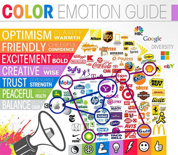
4. Experiment with colour. People react to various colours differently, which can be handy to know if you’re trying to invoke a particular emotional reaction to your advert. For example, according to this Colour Emotion Guide by Massimo Chieruzzi, blue invokes feelings of trust, orange brings feelings of happiness, and green makes you feel peaceful. So if you want your consumer to associate your brand with creativity and wisdom, purple might be a good colour to use.

5. Brevity isn’t everything – add detail and be specific where it counts. This might mean using a lingering zoom in a product video or a carefully selected adjective or statistic in written copy. Adding appropriate detail can help you to reach people with a specific objective in mind (and therefore more likely further into the sales cycle).
6. Tap into the audience’s so-called FOMO (‘fear of missing out’) by imposing a deadline or a countdown, for example: ‘Offer ends in 4 hours!’ This will make your offering seem more urgent than those of your competitors. If there isn’t a deadline you can still create a sense of urgency by using direct commands and exclamation marks: “MOVE FAST – GET IT BEFORE IT’S GONE!”
7. Replace your standard headline with a testimonial, as if the consumer his or herself is endorsing you. “The best lipstick I’ve bought yet – and I’ve bought a lot of make-up!”
8. Split your headline in two for dramatic effect. Example:
Finally.
Your very own home.
9. If you think you might have too much text, convert it into bullet points until the information is reduced to the bare essentials. You can then either leave them in bullet form or return it to a paragraph. Either way, the shorter sentences make it easier for the viewer to read or listen to, and reduces the time they need to process it.
10. Spend a little extra time selecting an image – it’s one of the first things the consumer will look at. Research suggests that people are more drawn to emotive imagery, so humanise your advert by teaming it with an image of a human or animal face conveying happiness, surprise, or another strong emotion. Experiment with stock imagery and do some AB testing to see what types of imagery have the best effect on click-through rate. Cartoons and drawings can also make your advert stand out.
11. Replace any features with benefits. Double-check your advert copy for any product features that might have snuck in. Remember to sell the experience of your product or service – not its components.
12. Try using a GIF in your advert instead of a static image. GIFs – animated images – are eye catching and modern, and stand out in a sea of static images. You can even use them in Facebook boosts. Simply find a clip from a relevant film, cartoon, or TV programme, and convert to a gif using a tool such as makeagif.com.
13. Anticipate viewers’ potential reservations about purchasing from you and provide proof to reassure them that they’re making the right choice. Example: Find out why 20,000 customers trust us to fit and maintain their security systems.
14. Is your advert copy positively chirpy? Try swapping Pollyanna language for more of an ‘Eeyore’ approach – he’s loveable for a reason. Upbeat tone is everywhere in advertising – a negative one will stand out more, so try drawing attention to the problems your product or service will solve. Example: ‘Bad hearing makes everyday interactions awkward and frustrating. Get your free hearing test today’
Read more:
Six Reasons Content That Polarises Your Audience Works
Five Tips For Creating Stand-Out Business Messaging
[bctt tweet=”14 quick digital ad tricks to drive more clicks #ppc #facebook #ads” username=”yellbusiness”]


