We’ve looked at how Facebook ads work and how much they cost on the site previously, and to follow this up I’ve picked out five interesting Facebook adverts that have caught my eye for one reason or another.
The five were spotted by me down the right-hand side of the Facebook desktop layout, and were displayed as I must have fitted the profile of the type of person the company was looking to target.

Swiftcover.com
This ad from car insurance firm Swiftcover is interesting for two reasons. Firstly, the company (or maybe the agency placing ads for it) has created bespoke, town or city-related images to fit with a user’s location. The example here has ‘Basingstoke’ placed on top of an image that ties in with the company’s wider marketing campaign. It’s good to use place names in adverts, as this can often catch the eye of a user, and Swiftcover has really taken this to the next level. This is reinforced by the use of ‘Basingstoke’ as the first word in the ad text, which brings me neatly on to the second point here. Almost every word in the ad has a capital letter at the start. This isn’t the norm, but it can give the text an air of authority, in the way that a news website might adopt this for its headline style.
 The Dictator
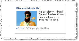
An ad promoting a page set up for a forthcoming film, this one for The Dictator has attempted to make itself regional, with the use of UK in the heading, and has a lighthearted feel about it. The image is of the star of the film, which should grab people’s attention, and the background is quite striking too. At a guess, I would say the ad is targeting people who have liked previous characters from Sacha Baron Cohen such as Bruno, Borat or Ali G.

LG Mobile
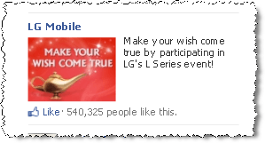
LG has really put its faith in the image here – there isn’t a lot of text and the heading isn’t very descriptive or persuasive. The use of red is a clever trigger as this colour will often be noticed over others on a web page, and this one certainly proved more eye-catching than others it displayed alongside down the right-hand side of the page.
 Freetricity
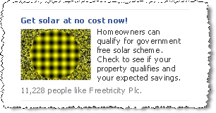
Another one that’s really gone for it with the image is this example from Freetricity, a solar panel installation firm. Instead of just using an obvious image of the sun, the company has selected an eye-popping picture that you simply can’t ignore. It’s one of those you have to look at because it’s so out of the ordinary. It’s a little bit ‘early 90s dance music’!
 Foster’s
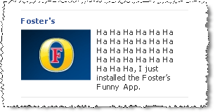
This one I love. Promoting a Foster’s Funny App (Foster’s recently comissioned new epoisodes of The Fast Show and Alan Partridge) , the advert text is so out-of-the-box it’s out of the door and on the train home. By just repeating ‘Ha Ha Ha’ until the end of the ad makes sure it really stands out alongside others. It’s humourous in itself, and with a plain heading and straight image, the text gets to be the highlight of the ad, as it should be with something so clever.


