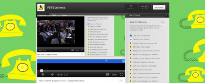
If you’ve got a YouTube channel for your business, or if you’ve just been browsing recently, you may have noticed a few changes to brand channels.
YouTube has rolled out a new design for channels that lets you, as the owner, customise the look and feel and do some other quite nice things you couldn’t do before.
So here’s a rundown on some of the new things you can now do, and how to make the most of the revamped platform for your business.
- Choose a layout As the channel owner you can now decide on a general look for your homepage.The four templates available are named ‘blogger template’, ‘creator template’, ‘network template’ and ‘Everything template’. You can switch between templates at any time. Take a look at the different options and decide which one is for you. The decision will come down to which one looks best in relation to how much content you have, how often you expect to add new videos and whether you have specific evergreen content you want to show off.
- Add links to external sites You can now include links off to other websites, and these display down the right-hand side of the homepage. There’s a limit on how much text can be included there, but you can add multiple links. YouTube also adds an icon next to the link, so if it is going off to Facebook, you get a Facebook logo, if off to Twitter, a Twitter logo, etc.
- Link channels together If you have more than one channel, but it makes sense to link them together, a new section of the homepage allows you to display ‘Featured Channels’.
All of your uploaded videos will cross over to the new platform, you can still add a background image (and it is easier now as you don’t need to create backgrounds now that blend with the individual modules) and other description text with migrate over too.
There’s loads more info on what you can do with the new channel design from YouTube itself.


