On a small-ish business budget, you just don’t have the wherewithal of the big guys with their fancy psychologically-tuned layouts and 24 hour website team.
I’ve gathered 10 things you probably didn’t have someone around to tell you when you built your website – and guess what? They’re super easy to put right.
1. Better buttons have alluring actions
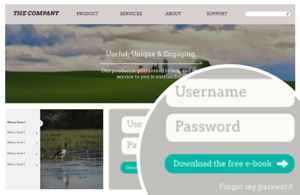
It might seem natural to put ‘Click here’ or ‘Submit’ on a button – after all, that’s what you want them to do. However, it’s wayyyy more convincing to tell people the benefit they get if they do.

Try:
- Download the free e-book
- Sign up for deal of the week
- Check how much you could save
Have a scan of your website for anywhere else you can replace nouns (Blog >) with verbs (Visit our blog >).
2. You need to lead your visitor by the hand
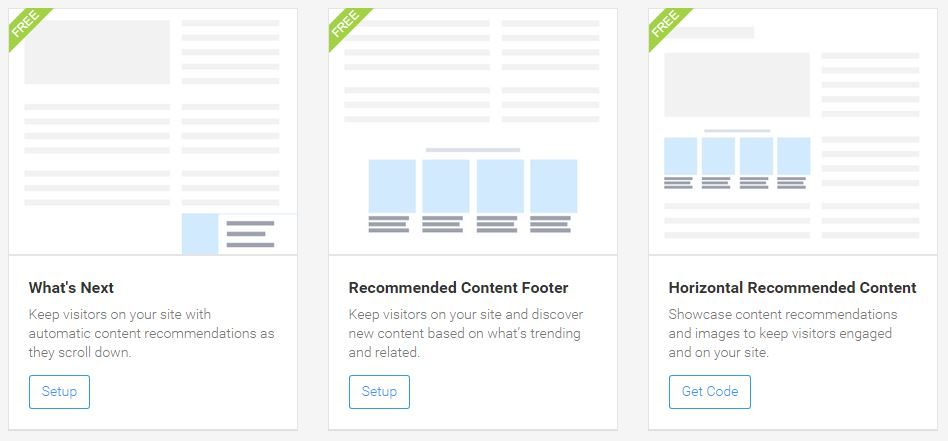
Verb-y buttons help with this, but you could also feature related products or content to keep the visitor clicking. There are lots of tools for this – I use AddThis myself, which also provides sharing buttons that you can track among other tools designed to increase actions on your website.
3. You must be understood by a 14-year-old
Yes, I know your welding/adult toy services may not be very interesting/suitable for a 14-year-old, but that’s the reading age that web standards demand you cater for. Never forget that around 50% of the UK’s working population have a reading age of 11 or lower.
It’s not that hard (just write how you’d chat to someone) and it’s very, very beneficial. Not only will your content be accessible to anyone, but it will also be easy for people to read in a hurry or while they’re distracted (100% of the average internet user’s time).
I wrote a bit about keeping copy readable, why don’t you go check it out?
4. Your workplace is boring
Don’t get hurt. I love your motivational posters, branded coasters and mood-enhancing potted plants, I do. But putting multiple photos of them on your website is just wasted pixels (unless you’re an interior designer and your office has actually won awards).

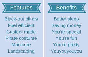
This comes back to the benefits not features thing: your visitors are only interested in themselves.
They want to know what they’re going to get out of this whole experience; not what screensaver you have. If you’re asking people to infer from your cheeky mug collection that they’ll get service with a smile…well. Try replacing those mugs with someone’s actual mug, smiling.
5. You can change stuff – and you should
Getting a website up and running can be stressful and frustrating, especially if you’re going it alone. Because of this, it’s very tempting to hit the GO LIVE button and then run away very fast in the opposite direction before it decides not to work.
I get it – you have everything perfect and you have other things to do, so why not just let the site tick over quietly by itself?
Three reasons:
- Change is good – particularly in terms of content freshness, which search engines reward because they judge you to be staying interesting and relevant.
- Change is good – humans enjoy new, exciting stuff. That’s exactly WHY search engines reward you for fresh content.
- Change is good – if you don’t evolve your website, you won’t improve it. It’s possible to see humongous changes in conversion rate just from tiny things like putting an arrow on a button. You won’t know if you don’t test it out.
Get more good stuff about building a great website >
[bctt tweet=”Does your website gently coax visitors along with signposts & snacks? Is it fresh? Is it alluring? “]


