HUGE NEWS. Instagram, home of square pictures, has just launched PORTRAIT AND LANDSCAPE IMAGES.
OMG.
I heard the news at 10pm last night and instantly texted every social media ‘expert’ (can never manage to type that seriously) I know. It’s big newz, you guyz.
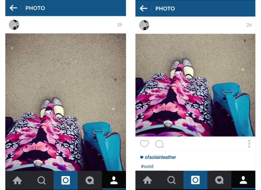
In a profile, nothing’s changed. I’d worried that the neat grid would be destroyed but that’s staying: your portrait and landscape images just get cropped square, and it’s the same in search.
In a feed, you get the images in their full glorious ratio. That means a longer scroll, which most screens aren’t going to handle all that well – you’ll get all image and no caption, which may not be what you want.
However, no one’s forcing you away from squares and I think the answer is to make sure your photos stick to the ‘rule of thirds’ thing: have the focal point of the image in the lower two-thirds so the image looks good as a square when someone scrolls to the caption.

So why have they done it?
Instagram reckon they’ve done it because the most important thing is ease of use for their users (read: advertisers). That’s a great reason to abandon your entire aesthetic – in fact it’s the only reason any brand should turn their back on a USP that’s worked for years and developed one of the most iconic and recognisable feeds in social.
I suspect that another reason is to get engagement with the app up. Most people share images to Instagram through their phone gallery – not by going into Instagram and uploading through there. The new formats are only available if you upload through Instagram, so that’s clearly going to get more people using the app for longer periods of time.
What’s in it for us?
Way less hassle for a start. I feel bad for the people who built apps to help everyone deal with Instagram’s square format – all those apps! – because that’s now a thing of the past. Video in particular is where I see this making a big difference as you rarely film something to a square, so editing for Instagram was a fiddle requiring third party apps. NO MORE.
A second benefit is that you get much more real estate in a feed. You now have about 30% more space in someone’s feed. That sound like *so?* but imagine you were paying for an ad in a newspaper. You go up 30% and it’s going to cost you big bucks. Instagram just gave you that for free.
All in, I think this is a positive change for business users of Instagram. Personally, I think it’s a teensy bit sad to move away from something so much a part of our social culture, but for someone trying to make a dime, this is good news.
And yep, I did just write a whole post about Instagram diversifying from squares to rectangles.
That’s my life. Have a good weekend.
[bctt tweet=”OMG, did you hear? Instagram just introduced portrait and landscape images!”]


